Would you like to create a world map in PowerPoint? Unfortunately, external map templates are usually inconsistent, difficult to format, and costly to buy from stock suppliers. We’ll show you how to insert and customize a world map in PowerPoint easily and free of charge.
PowerPoint contains an integrated world map
Many people don’t know that PowerPoint already contains an integrated world map function. The world map is available as a free PowerPoint chart in Office 2019 / Office 365. You can use PowerPoint maps to visually illustrate data by coloring, highlighting, and formatting individual countries or the entire world. You can even focus on specific regions/states, cities, and postcodes. Alternatively, there is also a way to embed interactive Google Maps snippets into your PowerPoint presentation.
What can the PowerPoint maps do?
Do you need to highlight or compare a country or district color? A PowerPoint ‘‘cartogram’’ (a combination of a chart/diagram and a map) can illustrate geographic data at a glance. Whether the expansion of your company into new countries (more information on that in our article on international brand management) or your products’ trade routes, a PowerPoint world map clearly and engagingly conveys information quickly.
Microsoft Office requirement:
PowerPoint mapping requires at least Windows 10 and Office 2019 or Office 365. In addition, an Internet connection is required to create or update maps. However, simply viewing a map works without a connection.

Connection to Bing
Bing drives the functionality behind the PowerPoint maps. The map diagram connects to Bing to get geographic data. You need to grant Bing permission before using PowerPoint maps, and that requires an Internet connection. Bing ensures that you always have the most current data available for your world maps.
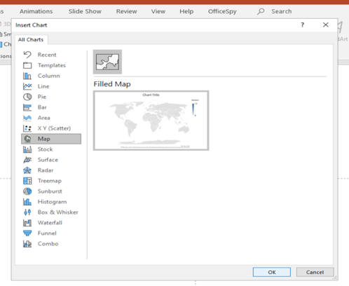
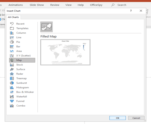
To add a world map to your slide:
Where do you find the PowerPoint world map feature? It’s not obvious – PowerPoint considers maps to be charts:
- On the PowerPoint Ribbon click on the Insert tab.
- Click “Chart” to open the Insert Chart dialog.
- Click on “Map” in the All Charts list.
- Click OK to insert a general world map into your PowerPoint presentation.
Enter your values in the Excel table:
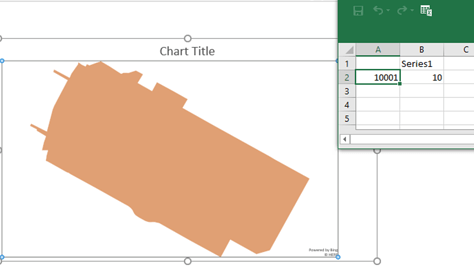
As soon as you have inserted the world map, a diagram and a default Excel table with different countries and example values appear automatically. Use the Excel table to insert, change, and delete countries and values. You can view and adjust the corresponding values in the Excel column “Series 1”. Your world map automatically changes the color shading of individual countries as soon as you change values in the Excel table. There is also a way to link your Excel table to your PowerPoint diagram.
Click on the X in the upper right corner of the Excel table to close it.
You can reopen the Excel table any time by right-clicking the map and choosing “Edit Data”. Or you can choose “Edit Data” from the Chart Tools > Design tab on the PowerPoint Ribbon.
Map variations
You can choose different types of maps, for example, you can focus on Germany or any other country in the world. If you select a specific country, you can highlight large cities, regions, or areas by postcodes, e.g. NRW, Bavaria and Schleswig-Holstein, etc. or Cologne, Frankfurt, and Munich, etc.
Cities and regions can only be mapped on the same level. You can simultaneously map Cologne and Berlin, for example, but not Cologne and Bavaria.
The following is an overview of the different display options of your PowerPoint map.
View: World Map
- Countries
- Regions (not recommended, because these are too small on a world map)
- Large cities (not recommended, because these are too small on a world map)
View: Country
- Regions / federal states
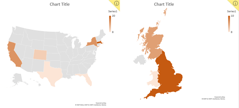
The USA and Great Britain
- Large cities (not recommended, because these are too small on a country-wide map)
- Postal codes (not recommended, because these are too small on a country-wide map)
View: Region / Federal States
- Postcodes
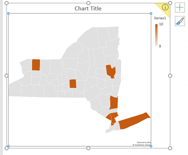
New York State
View: Postcode
- No further subdivisions are possible
District in Manhattan - NYC

Formatting and editing your map elements:
Once you have created your world map or map, you can customize its format and how it’s displayed.
One way to customize your map is to use the Design and Format tabs in the PowerPoint Ribbon Chart Tools group.
Alternatively, double-clicking on the chart opens the formatting task pane on the right side of the PowerPoint window. Pay attention to which part of the map you click on, as the formatting task pane only refers to the selected map element, such as Format Chart Area, Format Plot Area, or Format Data Series.
Map formatting
- Position
On the Chart Tools > Format tab use “Align” to position the map, for example, “Align Left”, “Align Center”, etc.
You can also grab the world map with the mouse at the outer edge and move it. - Size
On the Chart Tools > Format tab, adjust the height and width of the map in the “Size” group. Or, double-click on the outer edge of the map to open the Format Chart Area task pane, then choose “Size & Properties”. - Legend position
You can align the map legend almost anywhere inside the map area: left, right, top, bottom, etc. Double-click directly on the legend to open the Format Legend task pane and under “Legend Options” select where you want it to appear.
Tip – Quick Access: Using the plus symbol on the outer right edge of the map, you can select whether the legend, title and/or caption should be displayed.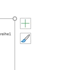
- Map proportions
Several map types or “projections” are available, depending on whether you’re showing the entire world or just specific regions or countries. For example, the “Robinson” projection shows Africa enlarged and Russia and Canada in reduced size. The “Miller” projection is the exact opposite. Each projection has advantages and disadvantages, so decide for yourself which one suits your presentation best.
Here’s how: Double-click anywhere in the middle of the map (except the points highlighted by the heatmap) to open the Format Data Series task bar opens. Or click on the dropdown item in bold under the task pane title to select “Series”. Choose what works best for you under “Series Options”. - Hide countries
If you only want to display the countries that have values in the Excel table, use the “Map area” dropdown on the Format Data Series task pane to select “Only regions with data”. “Automatic” or “Multiple countries/regions” will show countries in their regional context.
Lettering
Map title
You have several options for changing and positioning your title.
To change the position of your title or remove it completely:
- Click on “Add Chart Element” on the Chart Tools > Design tab.
- Choose “Chart Title” in the Add Diagram Element menu.
- Select “None” to remove the title from the map, “Above Diagram” to position it above the map, or “Center Overlay” to position the title on top of and centered on the map.
If you click on “More Title Options...”, the Format Chart Title task pane opens. That task pane also opens when you double-click on the map title.
You can also click on the large plus (+) symbol next to your map to adjust the Chart Title.
Data labels:
Would you like country data to appear on the map? Here’s how:
- Click on “Add Chart Element” on the Chart Tools > Design tab.
- Choose “Data Labels”.
- Select “None” to hide data labels or “Show” to show them.
If you select “More Data Label Options…”, the Format Data Labels task pane opens with additional data label configuration options.
You can also click on the large plus (+) symbol next to your map to adjust Data Labels.
The Format Data Labels task pane includes additional options:
- “Label Options”: Name, Category, Value, and what separator to use between them.
- “Number”: Category (Number, Currency, Percent, etc.) or a custom format.
Text color, size, and effects:
You can change title and label text formatting by:
- double-clicking on the title, or
- right-clicking on the title or legend, or
- in the task pane
Right-click or double-click on the title and label to change fonts, sizes, colors. Right-clicking gives you the most options. The task pane controls special effects like text fill, outline, shadows, and more.
Delete data values:
To delete all data labels from the map, right-click on a value and choose “Delete”. To delete a specific data label but not all, click on the data label you want to delete and press the Delete key.
Comments:
To add comments to your PowerPoint map, right-click anywhere your map and choose “New Comment”. The Comments task pane contains all comments on a map.
Color scheme:
Before you change colors, consider carefully what color scheme to use, so that your map harmonizes with the entire presentation. This is especially important when doing brand presentations for clients or suppliers and a way to control your brand.
You can adjust your map’s colors in several ways:
- On the Chart Tools > Design tab, click the “Change Colors” button.
- On the Format Data Series task pane, choose Series Options > Series Color.
- Select individual countries, right-click and choose “Fill” and optionally “Outline”.
You can define a color scheme for all regions that you enter in your Excel table. Remember, when adjusting individual countries’ colors, use colors that fit your overall color scheme and complement the rest of your map.
To color your map’s background, click on the outer edge of the map to open the Format Chart Area task pane to adjust “Fill” and “Line”. You can also right-click on the map edge to open a popup menu with the same options.

Animation
You can animate your map. Animation might be suitable if you want to demonstrate the evolution of different values.
Here’s how:
- Copy your map, either click the border of your map and right-click to copy, or copy the entire slide.
- Change the second map as you wish.
- Click the border of your second map, choose “Copy”, then paste directly on top of the first map.
- Click on the Animations tab in the PowerPoint Ribbon and choose your fade effect. “Fade” is usually best, so you get a smooth transition from map 1 to map 2.
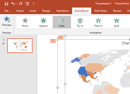
Use preview mode to confirm that your animation works as expected.
Advanced functions through Excel
Excel 2019 also includes map charts. Excel has more extended map functions than PowerPoint: PowerPoint’s map function is limited to 12 data points, while Excel maps can include more. Also, Excel supports easier mapping using postal codes from more countries.
To take advantage of Excel’s enhanced map functions in PowerPoint:
- Create a map in Excel.
- Copy it in Excel.
- Switch to PowerPoint and choose where you want to insert the Excel map.
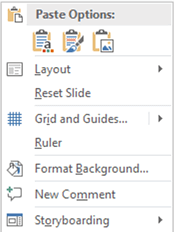
- Right-click where you want to paste the Excel map, and under Paste Options choose “Use Destination Theme” or “Keep Source Formatting”, as you wish.
Changes made to the map in Excel automatically update the copy of the map in PowerPoint.
Templates
If you don’t have the right version of PowerPoint or you want to avoid all these steps, you can also use templates provided by Microsoft.
Microsoft’s world map templates can be found here:
https://templates.office.com/en-US/maps
Limitations:
As the world map function is still relatively new, there are still some limitations and room for improvement:
- You can only choose a total of twelve countries per map diagram that you want to display. The value table only takes up twelve lines. Tip – Excel’s map function can record more than twelve values and can easily be inserted into PowerPoint as a map.
- Specifying postal codes only works in a few countries (USA, Great Britain, France, and Germany). However, when using postal codes the whole country is displayed, so highlighting individual postcodes will be much too small to see properly. The exception to this is the USA, where the 50-state PowerPoint map allows you to format things at the state level, which are then clearly visible.
- Geographic data like cities can sometimes cause an error message. Try replacing all city data with postal codes to resolve this problem.
- You can only create maps when connected online. But once a map has been created, you can view and edit it offline. However, if you are offline, you can’t add new countries.
- PowerPoint maps can hang or crash PowerPoint. Stability issues arise mostly when there’s a slow Internet connection, or you click around too much to highlight different countries. PowerPoint maps are far from unusable, but make sure you save them regularly.
Do you want to learn more about PowerPoint functions?
PowerPoint today offers much more than what you may have been used to. empower® Chart Creation can help you take PowerPoint to the next level. Whether it's corporate design compliance, a slide library directly in PowerPoint, or agenda creation.
If our world map chart has given you an incentive to learn more about PowerPoint, you can also download "The Ultimate PowerPoint Study" for free.


Animate PowerPoint Charts individually with few steps

How to insert an interactive map into PowerPoint