In reports or evaluations using Excel spreadsheets, a large amount of data is often presented in one or more tables. In many cases, this is a period analysis. In order to visualize the development of data, for example the number of orders per month, it is useful to create a diagram.
Use sparklines to create charts in Excel
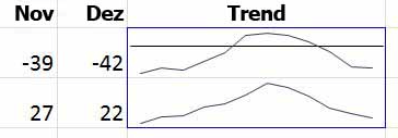
But charts, when displayed within the spreadsheet, tend to take up a lot of space. If they are alternatively displayed in a new spreadsheet, however, not all information is visible at a glance. Excel offers a solution here to visualize data right in the cell in the form of a small chart.
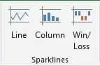
- To do this, select the "Insert" tab in the menu bar. There you will find the Sparklines section. Here you can choose from three different design types.
- Select the cell in which the diagram is to appear.
- Select the desired display type in the menu bar.
- Define the cell range whose data is to serve as the basis for the diagram.
This allows you to visualize developments clearly and compactly within a spreadsheet and thus enhance reports or analyses.
Another way to enhance reports is by presenting all data in the colors of the corporate design. That takes a lot of time formatting, but what if there were a solution that allows you to automatically create content in your corporate design?
Our Chart Creation solution enables you to create PowerPoint presentations and charts in your corporate design colors. No more endless formatting to get the color and dimensions just right, because our solution takes that work out of your hands!
Contact us for more information! Our team will be happy to answer any questions you may have!
If you want to plan projects precisely and create a visual schedule, Gantt charts are especially good for this. Did you know that you can create this in a few steps with Excel? Find this and more tips and tricks in our Microsoft 365 guide.


Data visualization software - put an end to hours of visualization

10 free stock photo sources for PowerPoint presentations