

A stacked column chart in PowerPoint is useful when your audience needs to understand two things at once — the total value of a category and how that total is divided among its components. It is less effective when individual segments need to be compared precisely because only the bottom segment shares a common zero baseline.
Whether you should use a standard stacked chart, a 100% stacked chart, or a clustered chart therefore depends primarily on the message you want to communicate.
In this article, you will learn when a stacked column chart is the right choice, which version best fits your message, and how to create one step by step in PowerPoint.
What does a stacked chart show?
Clustered, stacked, or 100% stacked: Which version Is right?
Stacked column or stacked bar chart?
How to create a stacked column chart in PowerPoint
Preparing your data: Order and structure
Showing individual values, percentages, or totals
How to show totals above stacked columns
What should you consider when using negative values?
Which chart fits which goal?
Common mistakes with stacked charts
Simplifying recurring workflows
What does a stacked chart show?
A stacked chart displays multiple data series on top of one another within each category. The total height of a column represents the overall value, while the individual segments represent its components.
Consider this simple revenue comparison:
| Year | Product A | Product B | Product C | Total |
| 2024 | 4,2 | 3,1 | 2,7 | 10,0 |
| 2025 | 5 | 4,0 | 3,5 | 12,5 |
| 2026 | 6,3 | 4,8 | 3,9 | 15,0 |
These data can answer different questions. The right chart type therefore depends not only on the dataset, but also on the story you want the chart to tell.
You can find an overview of other visualization options in our article on the most important chart types.
Clustered, stacked, or 100% stacked: Which version Is right?
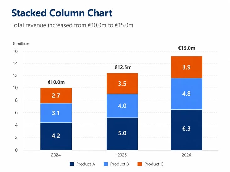
If your primary goal is to show that total revenue increased from €10 million to €15 million and how the three products contributed to that growth, a standard stacked chart is a good choice.
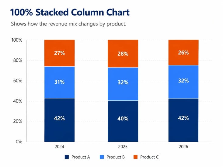
If the focus is instead on how the percentage share of revenue changes across the three products, a 100% stacked chart is more appropriate. Every column has the same total height, shifting the focus from absolute values to relative proportions.
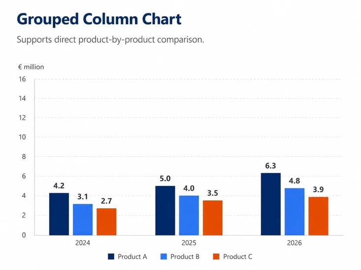
If you want to compare how Product A performs against Product B or C as precisely as possible, a clustered chart is usually easier to read.
A simple rule of thumb:
Compare individual values → use a clustered chart.
Compare totals and their components → use a stacked chart.
Compare proportions → use a 100% stacked chart.
Stacked column or stacked bar chart?
The orientation of a chart can also affect readability. Stacked column charts work particularly well for showing trends over time across a small number of periods, such as years or quarters.
A stacked bar chart in PowerPoint is often a better option when you need to display many categories or long category names. The horizontal layout provides more room for text.
In short, columns generally work well for time-based trends, while bars are often easier to read when category names are long.
How to create a stacked column chart in PowerPoint
Creating a stacked column chart is quick. The more important step is formatting it afterward so the intended message is immediately clear.
- Open the desired slide and select Insert → Chart.
- Open the Column category.
- Select Stacked Column or 100% Stacked Column.
- Replace the sample data in the spreadsheet with your own values.
- Check that the categories and data series are arranged correctly.
- Remove chart elements that do not support your message and add data labels where they provide useful context.
- Finally, check the colors, number formats, and axis scaling.
For a horizontal version, select Bar and choose a stacked or 100% stacked bar chart.
When working with absolute values, it is especially important to check the axis carefully. Learn more in our article on how to scale chart axes correctly.
Preparing your data: Order and structure
The order of the data series affects how easily they can be compared. The bottom segment always starts at the same zero baseline, making it particularly easy to track across multiple columns.
Place important data series toward the beginning of the stack and keep the order consistent. Categories such as “Other” will usually work best at the end.
Showing individual values, percentages, or totals
Do not automatically label every segment. Choose labels based on the message you want to communicate.
Use absolute values when specific amounts matter, percentages for 100% stacked charts, and total values when the complete stack is the focus.
Displaying totals above stacked columns can make comparisons much easier.
How to show totals above stacked columns
If you want to display total values above the columns, you can use an additional helper data series:
- Add another row or column called “Total” to the data sheet and calculate the sum of all segments for each category.
- Add these values as an additional data series to the chart.
- Select the new data series and change only its chart type, for example to a Line chart.
- Add Data Labels to the helper series and position them above the columns.
- Hide the line and data points of the helper series. Only the total values will remain visible.
Because data labels can be linked to the underlying data, updated values can also be reflected in the chart.
This approach keeps the individual segments visible while making the total value of each column easy to see.
You can find additional options in our article on data labels in PowerPoint charts.
What should you consider when using negative values?
Negative values should be used carefully in stacked charts. Positive and negative segments appear on different sides of the zero line, which can make quick comparisons more difficult.
If positive and negative values are central to your message, a clustered chart or another type of visualization may be easier to understand. Negative values are particularly challenging in 100% stacked charts because interpreting them as a “share of the whole” can quickly become confusing.

Which chart fits which goal?
The following overview can help you choose the right format:
| Chart Goal | Recommended Format |
| Compare total size and composition | Standard stacked chart |
| Compare percentage composition | 100% stacked chart |
| Compare individual data series precisely | Clustered chart |
| Display long category names | Stacked bar chart |
| Show trends across a small number of periods | Stacked column chart |
| Display many segments and time periods | Consider an alternative visualization |
Common mistakes with stacked charts
The biggest weakness of stacked charts usually appears when they are expected to do too much at once.
Too many segments make it difficult to track individual data series across multiple columns. Changing the order of the segments makes this even harder.
A 100% stacked chart can also create the wrong emphasis when absolute differences are important. A category worth €1 million appears just as large as one worth €20 million.
Too many data labels can make the chart look cluttered. And when individual segments need to be compared as precisely as possible, a clustered chart is often the better alternative.
Simplifying recurring workflows
For a single chart, labels, colors, and number formats can usually be adjusted manually. Across many slides, however, this work can quickly become time-consuming and error-prone. Totals may not be formatted consistently, number formats may differ, or labels may need to be adjusted again after the data changes.
Tools such as empower® Chart Creation can help standardize recurring formatting tasks and speed up chart creation in PowerPoint. The underlying decision remains the same, however. The tool supports the implementation, while the appropriate chart type still determines the message.
Conclusion: Start with the message, then choose the chart
A stacked chart works particularly well when you want to show the total value and its composition together. For comparing proportions, the 100% version is a good fit. For precise comparisons of individual data series, a clustered chart is usually the better choice.
Making this decision before creating the chart helps keep the visualization clear and ensures that the most important message is easy to understand at a glance.
FAQ: About stacked charts in PowerPoint
- When should you use a stacked column chart?
Use a stacked column chart when you want to show both the total value and how that total is composed. - What is the difference between stacked and 100% stacked charts?
A standard stacked chart shows absolute values and different total heights. A 100% stacked chart, by contrast, shows the relative composition of each category. - Which is better — clustered or stacked?
A clustered chart is better for precisely comparing individual values. A stacked chart is better for showing totals and their components. - How do you create a stacked column chart in PowerPoint?
Select Insert → Chart → Column → Stacked Column or 100% Stacked Column, and then enter your data in the spreadsheet that appears. - How can you show totals above stacked columns?
Add the totals as an additional helper data series, add data labels to the series, and then hide the helper series itself. This leaves only the totals visible above the columns


How to create a waterfall chart? A step by step guide

Create a Gantt chart in Excel in 8 steps