

Data labels are useful when your audience needs to see specific values at a glance. However, you should not automatically label every data point. Instead, highlight only the values that support the main message, such as the latest result, a high point, a variance, or a market share.
A presentation rarely fails because one number is missing. More often, the problem is that too many numbers compete for attention.
When every bar, point, and segment has a label, the chart can start to look like a table. All the values are visible, but the main message becomes harder to see.
Which numbers belong in the chart? When is the axis enough? And how should you format values, units, and percentages so they can be understood quickly? This article answers these questions.
What are data labels and when should you use them?
How to add data labels in PowerPoint Charts
Values, percentages, or category names in charts?
Format numbers, currencies and units consistently
Combine axes, legends and data labels effectively
Practical example: From 20 numbers to four clear values
Data labels in PowerPoint checklist
Frequently asked questions about data labels in PowerPoint
What are data labels and when should you use them?
Data labels are numbers or text displayed directly next to a data point or data series. In a column chart, for example, they can appear above or inside the columns. In a pie chart, they appear directly next to the segments.
Depending on the chart type, data labels can display:
- The exact value
- A percentage
- The category name
- The series name
- Content from a selected cell
Common examples include revenue figures, market shares, plan-versus-actual variances, current results, and individual outliers.
Before adding labels, ask yourself three questions:
- Does the audience need the exact value?
- Does this value support the main message?
- Is the number easy to read?
If a value simply repeats information that is already visible, you can usually remove it. Do not select every number available in the data table. Show only the values that serve a specific purpose during the presentation.
How to add data labels in PowerPoint charts
You can display data labels for the entire chart, a single data series, or one specific data point.
Add data labels to a data series
1. Select the chart.
Click the chart once. PowerPoint will display the Chart Design and Format tabs.
2. Select the data series.
Click a column, bar, line, or segment. PowerPoint will select all data points belonging to that series.
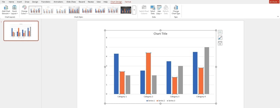
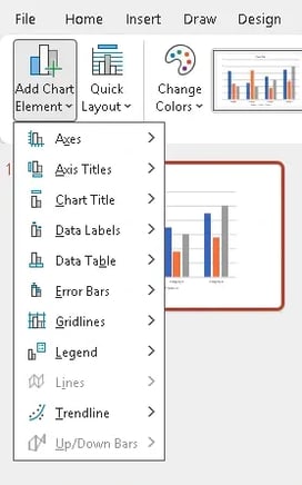
3. Open the label options.
Go to Chart Design, select Add Chart Element, and then choose Data Labels.
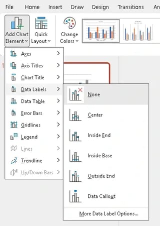
4. Choose the label position.
Depending on the chart type, you can select different positions. In column charts, labels can appear at the outside end, inside end, or center of the column. In line charts, they can appear above, below, or next to the data point.
You can also right-click a data series and select Add Data Labels. PowerPoint will add labels to all data points in that series.
The values remain linked to the underlying chart data. If the data source changes, the labels update automatically.
Label only one data point
If you want to highlight only a current value, outlier, or high point, follow these steps:
- Click the data series once.
- Click the desired data point a second time.
- Right-click to open the context menu.
- Select Add Data Label.
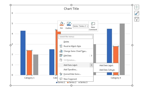
PowerPoint will label only the selected point. This lets you highlight individual values without filling the entire chart with numbers.
Adjust the content and number format
After adding data labels, you can choose which information they display
- Right-click a data label.
- Select format data labels.
- Open label options in the task pane.
- Select the information you want to display.
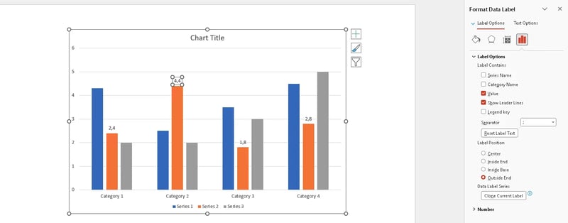
If you combine multiple pieces of information, you can also choose a separator. A line break is often easier to read than several pieces of information in one long line.
The same task pane lets you change the number format, decimal places, and label position.
You can move individual labels with your mouse. Before manually adjusting many labels, however, consider whether using fewer labels would produce a clearer chart.
Values, percentages, or category names in charts?
PowerPoint can display several types of information in one data label. However, combining too many elements can quickly create long blocks of text inside the chart.
The right choice depends on the question your chart is supposed to answer.
Exact values for absolute amounts
Show exact values when the specific amount matters.
Examples include:
- Revenue in dollars or euros
- Units sold
- Costs by department
- Number of employees
- Production volumes
- Processing times
When making budget decisions or evaluating progress toward a target, a specific amount can be important. If you only need to show which category is leading, the length of the columns or bars is often enough.
Percentages for shares and changes
Percentage values are useful for market shares, distributions, conversion rates, and growth rates.
In pie and doughnut charts, you can usually choose between the absolute value and the percentage. Showing both is rarely necessary.
Category names for faster identification
Category names are useful when it is difficult to identify a data point using the axis or legend. This is common with pie charts, doughnut charts, and directly labeled lines.
In bar charts, categories are usually already shown on the axis. Repeating them next to every bar adds little value.
A combination of category and value can be useful when it remains compact. Multiple pieces of information should only be displayed together when each one is needed to interpret the chart.
Format numbers, currencies and units consistently
A chart should use consistent formatting throughout. Mixing $1,250,000, $2.3M, and $980K makes comparisons more difficult.
Shorten large values consistently:
- 48,600 becomes 48.6K
- 1,250,000 becomes 1.3M
- $18,750,000 becomes $18.8M
Use only as many decimal places as needed to communicate the message. $12.4M is easier to read in a presentation than $12,437,892.17.
Currencies and units do not need to appear after every number. A title such as Revenue Growth in $M allows you to use short labels such as 3.2 or 4.1.
For changes or variances, make sure positive and negative signs are visible:
- −5%
- +$1.2M
Color can reinforce the message, but it should not be the only way to distinguish information.
For more information on displaying variances, see Plan-versus-Actual Variances in PowerPoint.

Combine axes, legends and data labels effectively
Axes, legends, and data labels serve different purposes. You can use them together, but not every chart needs all three.
Axes provide the frame of reference. In a column chart, for example, the category axis shows months or regions. The value axis provides the scale used to understand the size of the data. This means viewers can estimate the approximate value of a column even without a data label.
Data labels show the exact value directly at the data point, such as $12.4M above a column. They are especially useful when individual numbers are important to the message. With many data points, however, the value axis is often enough.
With only a few columns, the opposite approach can also work. If every value is displayed directly above the columns, you may be able to remove the value axis.
The legend explains which color or line represents each data series. With only a few series, you can often remove the legend when the names are displayed directly next to the lines or bars.
Which combination works for which chart?
Many data points with a clear trend:
Use axes and a legend. Label only selected values.
A few columns with important individual values:
Use category labels and direct data labels. Depending on the design, the value axis may not be necessary.
Several lines with clearly separated endpoints:
Use axes and label the lines directly. A legend is often unnecessary.
Pie or doughnut chart:
These charts do not have traditional axes. Use data labels or a legend to explain categories and values.
These elements are not interchangeable, but they can sometimes communicate the same information. Check what information is already available and what your audience needs in addition.
Practical example: From 20 numbers to four clear values
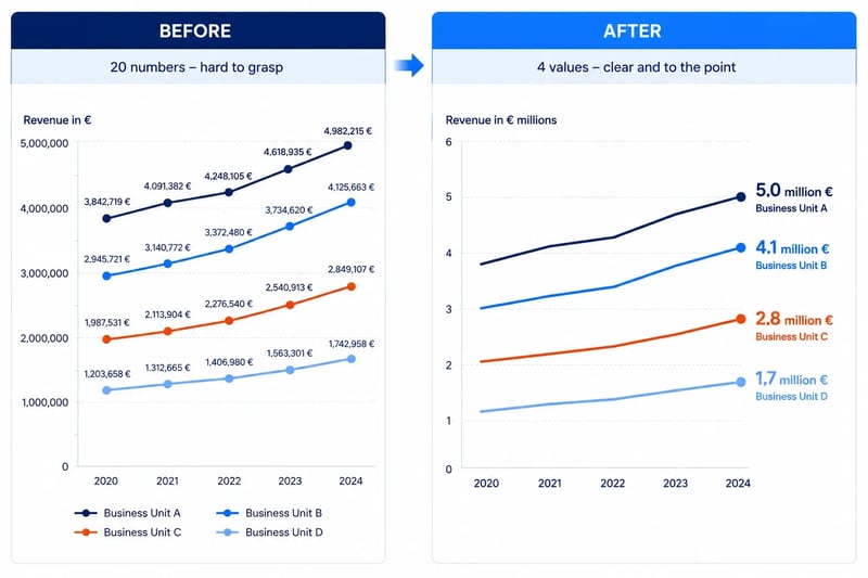
Imagine a line chart showing revenue for four business units over five years. It contains 20 data points in total.
In the first version, every point has an exact amount:
- $3,842,719
- $4,091,382
- $4,248,105
- Plus 17 additional values
The numbers are accurate, but the overall trend is difficult to see.
In the revised version:
- All values are shown in millions of dollars.
- Only one decimal place is used.
- Only the current year has data labels.
- Each series name is displayed directly at the end of the line.
- The legend is removed.
$3,842,719 becomes $3.8M.
Instead of showing 20 numbers, the chart now shows only four current values. The trend remains visible, while the current position can be understood immediately.
For recurring reports, these formatting choices need to remain consistent across presentations. When several people work on the same files, differences in units, decimal places, or label positions can quickly appear.
Specialized chart add-ins can standardize recurring formats. With empower® Chart Creation, for example, teams can apply shared conventions for numbers and labels across recurring presentation workflows.
This is particularly useful for more complex visualizations, including Mixed Charts in PowerPoint, Waterfall Charts, and Gantt visualizations.
Data labels in PowerPoint checklist
Before approving a presentation, check the following:
Content
- Does every label support the message?
- Are only relevant values visible?
- Is it clear whether a number represents a value, percentage, or change?
Number Format
- Do all values use the same scale?
- Is the number of decimal places appropriate?
- Are currencies and units consistent?
- Are positive and negative values clearly identified?
Readability
- Do any labels overlap?
- Is the text readable from a normal viewing distance?
- Do the numbers have sufficient contrast?
- Can duplicate information be removed?
Message
- Is it immediately clear what the audience should focus on?
- Does the most important value stand out?
- Would another chart type communicate the information more clearly?
Conclusion
Data labels should direct attention to the values that matter most. They do not need to be complete or visible everywhere.
A professional PowerPoint chart with effective data labels highlights relevant numbers, uses consistent formatting, and remains easy to read from a normal presentation distance.
For every number, ask whether it contributes to the message. If it does not, remove it from the chart.
Frequently asked questions about data labels in PowerPoint
How do I add data labels in PowerPoint?
Select the chart and open Chart Design. Select Add Chart Element and then Data Labels.
Use Format Data Labels to adjust the content, position, and number format.
How do I format data labels?
Right-click a data label and select Format Data Labels.
If you select the entire data series, the changes apply to all associated labels. Select an individual data point to change only its label.
How do I show percentages in a PowerPoint chart?
For pie and doughnut charts, select Percentage in the label options.
For other chart types, calculate the percentages in the source data and then format them as percentages.
How can I display values in millions?
Use an appropriate number format or convert the values in the data source to millions.
Specify the unit in the chart title, axis title, or directly in the label.
Should I display the axis and data labels at the same time?
With many data points, the axis is often enough. With a few important values, using both can be helpful.
For example, a line chart can retain its axis while labeling only the latest value for each line.
How can I prevent overlapping data labels?
First, reduce the number of labeled values. You can then move individual labels or select a different label position.
If the chart remains difficult to read, consider using a different chart type.
Can I use custom text as a data label?
Yes. With Value From Cells, you can use content from a selected range of cells as data labels.
This is useful for custom notes or calculated metrics.
How do I label only one data point?
Click the data series once and then click the desired data point again.
You can then add or format a data label for that point only.


Market share, segments, and relative sizes in PowerPoint

Scale PowerPoint chart axes: Zero baseline, intervals, and secondary axes