
When combination charts are effective and how to build them efficiently
Combination charts are useful when a simple chart is not enough to communicate the main point clearly. They allow you to show absolute values and trends in a single visual, which makes them especially helpful for reporting, FP&A, and management presentations.
However, combination charts also require careful structure, clear labeling, and clean design. When they are not built properly, they can quickly become harder to read than a standard chart.
What is a mixed chart?
A combination chart, also known as a combo chart or mixed chart, combines two different chart types in one visualization. The most common example is a column chart combined with a line chart.
This format makes it possible to show two related metrics together, even when they serve different purposes. For example, one metric may show an absolute value, while the other shows a trend, percentage, or rate of change.
A combination chart is not simply a random mix of chart types. It is a structured way to show related data points in a compact, easy-to-understand format.
Mixed Chart vs. standard chart
A standard chart uses one chart type and follows one clear visual logic. A column chart, for example, shows categories and values. A waterfall chart shows how a starting value changes step by step. These charts are usually easy to understand because they focus on one type of message.
A combination chart adds another layer. It combines two chart types to show the relationship between different kinds of data. This can make the chart more informative because it shows values and trends, or volumes and percentages, at the same time.
Key benefit: Related data becomes visible in one chart.
Main risk: The chart can become too complex if it is not designed carefully.
When to use a mixed chart
A mixed chart is most useful when two metrics are closely related but should not be shown using the same visual format.
Use it when:
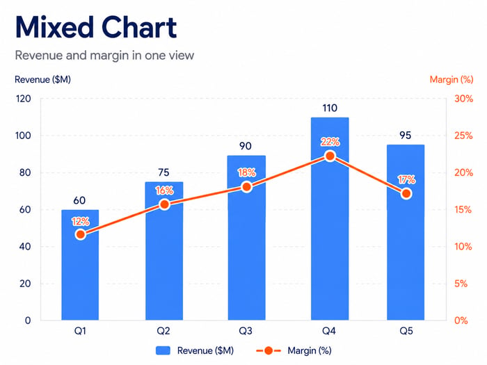
- Revenue and margin need to be shown together
- Sales volume and growth rate belong in the same view
- Budget figures and target achievement need to appear in one chart
- Absolute values and relative trends are both important
A mixed chart is less effective when :
- Too many data series are included
- A simple chart would communicate the message clearly
- A secondary axis is used only for visual effect
- The chart requires a long explanation before the audience understands it
In management and FP&A presentations, a combination chart should simplify the message, not make it more complicated.
Common business applications for mixed charts
- Finance and controlling: Revenue shown as columns and margin shown as a line
- Sales: Sales volume shown as columns and growth rate shown as a line
- Project management: Budget or effort shown as columns and progress shown as a line
- Management reporting: Actual results combined with target achievement or variance in one visual
Common mistakes when creating mixed charts
The most common mistake is using a combination chart without a clear business reason. Other frequent issues include:
- Combining unrelated metrics
Two values are shown together even though they do not have a clear relationship. - Using a line for the wrong data series
The line chart does not support the meaning of the metric. - Scaling the secondary axis incorrectly
Poor scaling can make relationships look stronger or weaker than they actually are. - Including too many series or categories
The chart becomes crowded and loses clarity. - Using unclear labels or legends
The audience cannot immediately tell which data series belongs to which chart type. - Creating a weak visual hierarchy
Colors, lines, and axes do not guide attention to the most important message.
How to build a mixed chart in Excel or PowerPoint
You can create a combination chart in Excel or PowerPoint without specialized add-in software. First, prepare the data so both metrics can be compared across the same categories or time periods.
- Structure the data logically
- Choose the main chart type, usually columns or bars
- Add the second data series
- Set the second chart type, often a line
- Add a secondary axis if needed
- Adjust axes, colors, labels, and spacing
At this point, the chart is technically built. In practice, however, the more time-consuming work often begins with formatting and fine-tuning the visual.
Why manual creation of a mixed chart takes time
Although PowerPoint supports combination charts, creating them manually can quickly become inefficient. The challenge is not only the chart type itself, but also the limits of PowerPoint’s native charting features.
Manual creation becomes especially difficult when:
- More complex chart logic is needed
- Secondary axes must be aligned manually
- Formatting has to be updated after data changes
- Elements such as breaks, markers, totals, or delta lines require manual work
- Recurring chart types need to be standardized across teams
For recurring reports or shared presentation workflows, one chart can quickly become an ongoing productivity issue.
How add-ins improve efficiency
Chart add-ins help standardize and automate the creation of combination charts. Instead of building each chart from scratch, teams can use predefined chart logic, structured chart types, and consistent formatting.
This is especially valuable when combination charts are used regularly in reports, management presentations, or FP&A documents.
Benefits include:
- Less manual formatting
- More consistent chart logic
- Faster updates when data changes
- Lower risk of errors in axes, data series, and layout
The main advantage is not only speed. It is repeatability.

How empower® supports mixed charts and complex visualizations
The empower® chart add-in helps teams create professional charts directly in PowerPoint. It also supports more complex visualizations where different types of data need to be combined in a clear and consistent way.
For combination charts, this is especially useful because charts do not have to be rebuilt and reformatted manually every time. empower® supports teams with features such as:
- Brand-compliant chart templates
Charts follow approved colors, fonts, axes, and other design standards. - Combination charts with two value axes
Columns, bars, and lines can be combined using two different scales. - Excel links
Charts can be linked to Excel files stored on drives, SharePoint, or Teams. - Productivity tools
Total labels, delta lines, CAGRs, breaks, and other features reduce manual work. - Consistent scaling across multiple charts
The heights and value axes of multiple charts can be aligned. - Conversion of existing charts
Existing PowerPoint charts can be converted into empower® charts.
This is especially valuable for companies that create charts regularly for reports, presentations, and decision-making documents.
To see how combination charts and other complex PowerPoint charts can be created more efficiently, take a closer look at empower® Chart Creation.
FAQ on Mixed Charts / Combination Charts
What is a mixed chart?
A mixed chart is a combination chart that brings two different chart types together in one visualization, typically columns and a line.
When should you use a combination chart?
Use a combination chart when two related metrics need to be shown together, such as absolute values and their development, or quantities and ratios.
What is the difference between a mixed chart and a standard chart?
A standard chart uses only one chart type. A mixed chart combines two chart types to show more complex relationships.
When is a secondary axis useful?
A secondary axis is useful when two data series have very different scales and would otherwise be difficult to read in one chart.
What mistakes should you avoid in mixed charts?
Common mistakes include using too many data series, creating an unclear secondary axis, combining unrelated chart types, and overloading the design visually.
Can you create mixed charts directly in Excel or PowerPoint?
Yes. However, manual creation can quickly become time-consuming when professional formatting and recurring reporting requirements are involved.
How does empower® support mixed charts?
empower® helps teams create complex PowerPoint charts in a more structured, consistent, and efficient way, especially for recurring business reporting needs.

Convert charts: How to successfully switch PowerPoint chart add-ins

Key PowerPoint chart types and their best uses