
How do I create a waterfall chart step by step? How do I add sums, connecting lines or other properties to a waterfall chart? We will show you how to create, label, and edit a waterfall chart yourself via Excel or directly in PowerPoint. Check out our Microsoft 365 guide for more tips and tricks to help you work with Microsoft applications.
How do I read a waterfall chart?
A classic waterfall chart is read from left to right. You see a so-called running total, whose values are added or subtracted. The categories on the horizontal x-axis usually represent a time period, such as months or quarters. This allows you to evaluate, for example, whether a month ended positively or negatively and what the current balance looks like.
Editing options for waterfall charts
Since Office 2016, a waterfall chart is included as a basic chart type in both Excel and PowerPoint. Check out our article on creating charts without dedicated software to find out about more chart types in Excel and PowerPoint. In this article, however, you will learn how to create a waterfall chart in addition to:
- display totals
- display a negative range
- insert stacked columns (empower®)
- insert breaks (empower®)
- show a connector line
- create a waterfall chart in landscape format (empower®)
- change column colors
How to create a waterfall chart directly in PowerPoint?

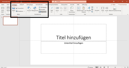
- In the PowerPoint Ribbon, first, click on "Insert" and then on "Chart".
.png?width=800&height=535&name=Screenshot%20(7).png)
- In the chart list, select "Waterfall" and click "OK". Your waterfall chart with a linked Excel sheet will be inserted into your presentation.
.png?width=800&height=409&name=Screenshot%20(8).png)
Alternatively, you can also click on the diagram placeholder of a slide. This will also open the diagram list and your waterfall chart will be displayed at the exact location of the placeholder.
.png?width=800&height=445&name=Screenshot%20(9).png)
.png?width=392&name=Screenshot%20(10).png)
- Right-click on the chart, and you can select "Edit data" to open the Excel sheet that contains the waterfall data. Below you can see how to add or remove sums or connecting lines. You can also use your data from an external Excel file and link them together. You will see how this works in the next section, Create a waterfall chart with Excel.
.png?width=800&height=554&name=Screenshot%20(11).png)
How to create a waterfall chart with Excel?

Do you want to insert data from an Excel spreadsheet into PowerPoint and display it as a waterfall chart? You just need to follow these 4 steps:
- Select the desired data table in Excel and then click the "Insert" tab on the Ribbon.
.png?width=800&height=517&name=Screenshot%20(12).png)
- In the center of the Charts group, you will see a waterfall icon. Click on it and then select "Waterfall" from the list at the top. Your values will be displayed as a waterfall chart in Excel. Do not be surprised if totals are not displayed correctly, you can easily edit this afterward. See headline: Display totals in waterfall chart.
.png?width=800&height=521&name=Screenshot%20(13).png)
- Now click on the diagram to copy it (either with right-click + copy or with CTRL + C).
.png?width=800&height=475&name=Screenshot%20(14).png)
- Open your PowerPoint presentation and insert your waterfall chart at the desired position with right-click + paste or CTRL + V. Now your waterfall chart is displayed with the Excel values.
.png?width=800&height=469&name=Screenshot%20(15).png) Do you want the presentation to update itself as soon as data in the Excel file changes? No problem, in our article “Automatically update PowerPoint Excel links – save time and money” we show you how to do it.
Do you want the presentation to update itself as soon as data in the Excel file changes? No problem, in our article “Automatically update PowerPoint Excel links – save time and money” we show you how to do it.
How to edit waterfall charts?
Learn how to edit a waterfall chart. We will show you how, using a diagram in PowerPoint, but in Excel, the editing steps work the same.
Display totals in a waterfall chart
In the example chart, you see there are no subtotals. We show you how to set totals e.g. for each Quartal.
Example: Subtotals and final total are displayed as "floating" instead of "standing".
Do you want to represent a column as a sum of the previous values? So that it grows starting from the x-axis and does not flow? Then simply right-click on the column and select "Set as Total" from the list. The other way around, you can click on columns and right-click to select "Clear Total". This will automatically adjust your waterfall chart.
.png?width=800&height=460&name=Screenshot%20(16).png)
.png?width=800&height=467&name=Screenshot%20(17).png) Example: Subtotals and total are displayed correctly.
Example: Subtotals and total are displayed correctly.
Show or hide connection lines
Double-click on any column in your waterfall chart so that the editing window appears on the right. Now you can check or uncheck the box "Show connector lines".
.png?width=800&height=338&name=Screenshot%20(18).png)
Show a negative range in a waterfall chart
If your data is in the minus range, a negative range is automatically displayed on the Y-axis.
.png?width=800&height=432&name=Screenshot%20(19).png)
Customize colors and layout
The columns are color-coded so you can distinguish the positive and negative numbers. However, if you are not satisfied with the preset colors of your waterfall chart, you can select a suitable color by double-clicking on a column.
.png?width=800&height=451&name=Screenshot%20(20).png)
Even easier is the global adjustment of colors. For example, all totals should be displayed in green. Double-click on the respective legend and select the appropriate color. Then all associated columns will be colored at once.
.png?width=800&height=445&name=Screenshot%20(22).png)
In order to control your brand, your charts should always match the colors, fonts, and features of your corporate design. With the empower® Chart Creation solution you can completely automate such tedious work. We show you how to comply with your corporate design in every presentation with just one click, in our article “Corporate Design Check with empower®”.
What additional features does empower® offer?
The Microsoft Office add-in empower® Chart Creation offers you more functionalities and types for waterfall charts directly in PowerPoint. The add-in simplifies the creation of design-compliant charts and saves you time.
-1.png?width=800&height=440&name=Screenshot%20(1)-1.png)
For example, use the waterfall chart with stacked columns or create a waterfall chart in a landscape with bars.
-1.png?width=800&height=462&name=Screenshot%20(3)-1.png)
You can insert breaks if the proportions of your displayed values are too different.
-1.png?width=800&height=422&name=Screenshot%20(4)-1.png)
It is also possible to add growth arrows, value lines, or other visualizations to strengthen and simplify your chart.
-1.png?width=800&height=482&name=Screenshot%20(5)-1.png)
You have a wide range of new possibilities to design your waterfall chart with just a few clicks. Our best practice video gives you an overview of the easy implementation.

With empower® Chart Creation you can create all your PowerPoint charts easily, consistently, and efficiently. Compared to using standard PowerPoint tools, empower® Chart Creation regularly saves users up to 50% of their time.
The solution includes key business chart types – from waterfall and Gantt to Mekko and combination charts. Thanks to smart Excel integration and automatic updates, linked charts, text, and shapes always remain current.
Find out more about the most useful charts in PowerPoint in our chart overview.
Do you have further questions about empower® Chart Creation? Please contact us!


Negative waterfalls with positive values in empower® Charts

Create a Gantt chart in Excel in 8 steps