


Charts in PowerPoint rarely come together perfectly on the first try. The process usually starts with data, a rough idea, or an existing chart that needs to be adapted quickly. This is where AI-powered charting becomes particularly interesting.
The real shift is not simply that AI can create a chart from a prompt. The greater opportunity comes when AI can work with an actual, structured PowerPoint chart. Importing data, placing the chart on a slide, adding elements, creating Excel links, changing colors, or editing individual chart components.
The empower® AI Chart Assistant within empower® Chart Creation is designed for this broader workflow. It supports users not only in creating new data charts and Gantt charts, but also in editing existing charts using natural language.
From prompt to chart – What is changing in charting
Create charts from excel, web sources, or screenshots
The interesting question is not just whether AI can create a chart
Excel as a data source – Import or link
Create and place charts directly in the PowerPoint context
Why Gantt charts are a particularly good example
From prompt to chart – What is changing in charting
Many discussions about AI in presentations begin with a simple question: Can AI automatically create a chart for me?
That is a reasonable question, but it only addresses part of the challenge. An automatically generated chart is truly useful only when it fits into the rest of the workflow. In PowerPoint, that means the chart needs to work on the slide, fit the existing layout, remain editable, and work effectively with the underlying data.
This is where AI-powered charting is evolving. It is no longer just about saying, "Create a bar chart for me." It is about tasks such as:
"Create a column chart from this revenue data and place it in the right content area of the slide."
Or: "Add a CAGR arrow between 2021 and 2024 and highlight the last data series."
Or: "Add three tasks and a milestone for the Steering Committee meeting in May to the Gantt chart."
These prompts do more than describe an image. They refer to a structured presentation element that can still be edited, aligned, and connected to its underlying data.
Create charts from excel, web sources, or screenshots
Chart creation traditionally starts with an Excel spreadsheet. You have the numbers, select a chart type, and transfer the result to PowerPoint. This workflow remains relevant. AI, however, opens up additional possibilities:
- You already have the data and enter it into the chat by copying and pasting or using a screenshot
- The relevant table is stored in an Excel file
- Data needs to be visualized from an accessible web source
- You only have a screenshot of an existing chart and want to rebuild its logic in PowerPoint
The empower® AI Chart Assistant can turn these different starting points into an editable PowerPoint chart. Images or screenshots of existing data or charts can also serve as a reference. The important point is that regardless of where you start, the result is not a static image. Instead, a new PowerPoint chart is created based on the displayed values, proportions, and similar colors.
This moves AI earlier in the workflow. You do not always need to organize everything into a perfect data table before you can start charting. AI can support you earlier in the process, when the data, template, screenshot, or desired outcome may not yet be clearly separated.

The interesting question is not just whether AI can create a chart
A chart is rarely finished as soon as it is generated. In many cases, the real work begins afterward. The message needs to be sharpened, a comparison highlighted, a time period added, or a data series emphasized differently.
That is why editing existing charts is an important part of AI-powered charting.
For example, you may already have a data chart on a slide and want to make the average value of a series visible. Instead of manually opening the chart, checking the values, and inserting the appropriate element, you can describe the task in the dialog. The Assistant can add a Value Line for the average or for a specific value.
Or perhaps you want to highlight a development between two data points. The Assistant can add a Growth Arrow, CAGR Arrow, or Delta Line between the relevant points. The AI is not simply working with the idea of "show growth." It is working with specific chart objects.
Visual adjustments also become more intuitive. If a data series needs to stand out, you can change the colors of individual data points or data series, including fill, line, marker, or border colors.
The difference from manual chart creation is significant. AI becomes more than a generator. It becomes a natural-language editing interface for data visualization.
Excel as a data source – Import or link
In many organizations, charts are closely connected to their Excel files. Budget figures, forecasts, and reporting tables already have an established source. AI-powered charting becomes particularly useful when that source can remain part of the existing workflow.
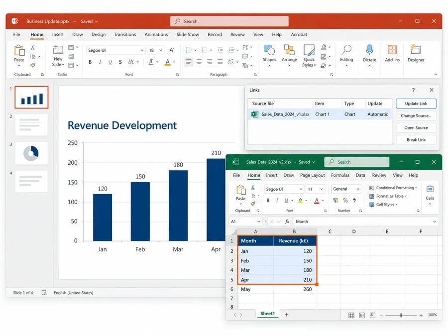
With the empower® AI Chart Assistant, Excel data can be incorporated into charts in two ways. The relevant data can be transferred to the chart's Mini Excel, or the chart can be connected to the source file through an Excel link.
Importantly, the empower® AI Chart Assistant does not modify the existing Excel file itself. Excel can therefore remain the central source for your data while charts are created more quickly and edited more precisely in PowerPoint.
Create and place charts directly in the PowerPoint context
A chart is never just a chart. It sits on a slide, competes with other elements, follows a layout, and needs to fit into the overall presentation logic.
That is why it matters that when creating a chart, you can describe more than just the data and chart type. You can also specify where the chart should appear on the slide, which existing placeholder it should use, or which other chart, shape, or placeholder it should align with.
This brings AI closer to the way PowerPoint is actually used. In practice, the task is rarely simply: "Create a chart."
It is more often something like: "Create a stacked column chart from this data, use the right placeholder, and add a Delta Line between plan and actual."
Instructions like these combine content, layout, and the intended message. That connection is what determines whether AI becomes genuinely useful in everyday presentation work.
Why Gantt charts are a particularly good example
Gantt charts make it especially clear why AI needs to understand more than numbers alone.
A Gantt chart is not simply made up of data series. It contains time periods, phases, tasks, milestones, markers, date lines, labels, and often additional status information. Working with a Gantt chart requires thinking not only in terms of values, but also in terms of project logic.
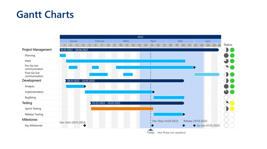
That makes editing Gantt charts a strong example of the next stage of AI-powered charting. The empower® AI Chart Assistant can edit existing Gantt charts while taking the current slide content and current selection into account.
You can have the time period adjusted automatically or specify a specific period. You can add or delete rows and phases, add Task Bars, remove Milestones, insert date lines, or adjust markers. Colors, labels, and status elements in Notes Areas can also be changed through the AI dialog.
This may sound technical at first. In practice, it means you can describe the change you want in the same way you would describe it from a business perspective.
For example: "Add a new phase for the test migration in the third quarter."
Or: "Set a milestone for the go-live date on October 15 and use the accent color."
Or: "Adjust the Gantt chart time period so that all tasks are fully visible."
AI can therefore work not only on the appearance of the chart, but also on individual objects within its structure.
When the right visualization has not yet been defined
Chart creation often starts with a message you want to communicate. Growth, comparison, distribution, variance, or a timeline.
In these situations, AI can also help you get started. If you do not specify a chart type, the empower® AI Chart Assistant can select an appropriate one. You can also have charts created without specific data. These charts initially contain default values and serve as a starting point for further editing.
This is particularly useful during the early stages of a project. You do not need to know every detail immediately. Instead, you can start with a rough visualization and gradually make the chart more specific.
Conclusion – From generation to collaborative editing
The most important development in AI-powered charting is not simply the automatic creation of the first chart. The greater opportunity lies in being able to continue working with that chart afterward.
A strong AI Chart Assistant therefore connects several layers. It understands data, takes the PowerPoint context into account, treats charts as structured objects, and enables changes to specific elements without interrupting the existing workflow.
The empower® AI Chart Assistant within empower® Chart Creation demonstrates what this workflow can look like in PowerPoint. You provide source material, describe the desired result, create a chart, connect it to Excel when needed, and then continue editing individual chart elements using natural language.
For teams that regularly create data-driven presentations, this is where the practical value lies. AI does not just help you get to a first chart faster. It also supports the parts of everyday chart creation that can take significant time. Adapting, highlighting, linking, and further developing existing visualizations.

Key PowerPoint chart types and their best uses

Modern PowerPoint charting – Why businesses choose empower® Chart Creation