
Gantt charts are one of the best ways to visualize project timelines in PowerPoint. However, building and maintaining them with native PowerPoint tools can be tedious and time-consuming. empower® simplifies the process by helping users create structured, consistent, and easy-to-update Gantt charts through a wizard or with prepared Excel data.
Using Gantt Charts for project planning
Anyone who presents projects in PowerPoint often needs to show timelines in a way that is easy to understand at a glance. That is exactly where Gantt charts are useful. They clearly visualize project phases, tasks, milestones, and time-based relationships, making them one of the most important chart types for project communication in presentations.
In practice, though, creating a Gantt chart in PowerPoint is usually much more demanding than it first appears. What looks simple often requires significant manual effort when native tools are used. Bars must be built by hand, timelines need careful structuring, updates have to be applied manually, and layouts must stay consistent. The effort increases quickly when schedules shift, multiple people work on the same presentation, or brand-compliant results are expected.
This article explains what a Gantt chart is, when it makes sense to use one, how to build one in PowerPoint, which common mistakes to avoid, and why empower® makes the process easier, more reliable, and more professional.
What is a Gantt Chart?
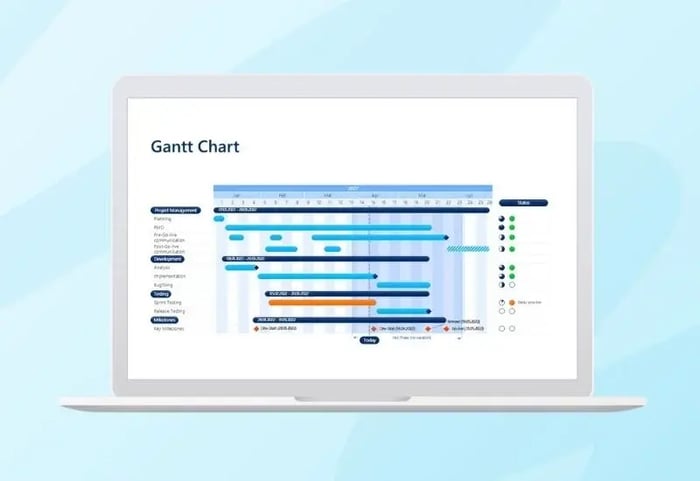
A Gantt chart is a visual representation of a project schedule. Tasks, workstreams, or project phases are displayed as horizontal bars along a timeline. This allows viewers to see when individual tasks begin, how long they last, which activities run in parallel, and where important milestones occur.
A Gantt chart turns complex timelines into a format that remains understandable even for people who are not deeply involved in the project. Instead of verbally explaining a long list of dates or a complicated project structure, a well-designed Gantt chart shows the logic of the project immediately.
What elements are typically included in a Gantt Chart?
A Gantt chart usually includes the following components:
-
Tasks or phases
The left side lists the individual project phases, subprojects, or work packages. -
Timeline
The top shows the progression of time, such as by days, weeks, months, or quarters. -
Bars
Each task is shown with a horizontal bar that represents its start, duration, and end. -
Milestones
Important events such as approvals, go-lives, or decision points are often marked separately. -
Optional progress or status indicators
Depending on the use case, the chart may also show which tasks are planned, in progress, completed, or delayed.
When should you use a Gantt Chart?
A Gantt chart is a strong choice whenever you need to present a project timeline in a structured and visual way. It is especially helpful when multiple tasks are connected and you need to show more than a few isolated deadlines.
Typical use cases for Gantt Charts
A Gantt chart is particularly well suited for:
-
Project planning
When a project needs to be broken into phases and scheduled over time. -
Project status presentations
When you want to show the progress of individual workstreams and highlight schedule changes. -
Rollout and implementation plans
For software deployments, migration projects, change initiatives, or communication campaigns. -
Client presentations
When you want to communicate structure, planning discipline, and reliability. -
Operational roadmaps
When a traditional roadmap is too high-level, but a simple task list would be too cluttered.
When is a Gantt Chart most effective?
A Gantt chart is especially useful when you want to:
- show multiple tasks across the same time period
- structure phases and sequences clearly
- make overlaps visible
- communicate dependencies more effectively
- explain a project through a clear visual logic
When is a Gantt Chart not the best choice?
Not every time-based visual needs to be a Gantt chart. This format is less effective when
- only a few individual dates need to be shown
- the audience only needs a high-level overview
- strategic priorities matter more than operational detail
- the timeline is still too uncertain to present reliably
How do you build a Gantt Chart in PowerPoint?
A Gantt chart can be built with native PowerPoint features, but a structured approach is essential. Anyone who starts immediately with shapes and lines often creates unnecessary complexity.
The better method is to define the logic first and then design the layout.
1. What should you define before you begin?
Before creating the chart, define:
-
which tasks or phases need to be shown
-
which timeframe matters
-
how detailed the time scale should be
-
which milestones need to be visible
-
whether status or progress should be included
-
who the presentation is for
This matters because a Gantt chart for a steering committee should look different from one built for an operational project team. Executives usually need a clear, simplified overview. Operational teams may need more detail.
2. What does the basic PowerPoint structure look like?
A Gantt chart in PowerPoint usually includes:
- a left column for tasks or phases
- a top row for the timeline
- a grid or other structured background
- bars representing each time period
- optional milestones, status indicators, or a legend
Technically, this is often built with:
-
tables
-
shapes
-
lines
-
text boxes
-
grouped objects
A common method is to create the basic structure with a table first. The first column contains the tasks, and the remaining columns form the timeline. Bars are then added using shapes.
3. How do you choose the right timeline?
The timeline has a major impact on whether a Gantt chart feels clear or overloaded.
Common options include
- days for short operational activities
- weeks for compact projects
- months for medium-length projects
- quarters for roadmaps or annual plan
Consistency matters most. The spacing of time units must be visually accurate and easy to follow. If the proportions are off, the chart immediately looks imprecise.
4. How do you draw the task bars
Each bar represents the timeframe of a task. Precision matters.
Pay attention to:
- consistent bar heights
- clean horizontal alignment
- consistent colors
- sufficient white space
- a calm, orderly layout
If you show both major phases and sub-tasks, the visual hierarchy needs to be clear. Otherwise, the chart quickly becomes difficult to read
5. How do you add milestones and status information?
Additional elements such as milestones or status indicators can make a Gantt chart much more useful, as long as they are used clearly and sparingly
Typical additions include
- go-live
- approval
- acceptance
- training
- launch
- decision point
You can also add status markers, such as:
- planned
- in progress
- completed
- delayed
The main principle stays the same. A Gantt chart should create clarity, not try to show every project management detail.
6. How do you improve the visual design?
Many Gantt charts fall short not because of the content, but because of the design. Good charts are clear, calm, and easy to understand quickly.
Helpful design principles include:
- removing unnecessary lines
- limiting the color palette deliberately
- making hierarchies easy to see
- keeping labels short
- using contrast intentionally
- leaving enough white space
A professional Gantt chart does not need to be flashy. It needs to be clear.

Why is a Gantt Chart so hard to build with native PowerPoint features?
PowerPoint provides shapes, tables, and lines, but it does not offer true Gantt-specific logic. That is why a chart that seems simple in theory often becomes a manual, high-maintenance build process in practice.
1. PowerPoint does not understand project logic
PowerPoint does not recognize concepts such as start date, duration, end date, or milestone. There is no native Gantt function that automatically turns structured timing data into a reliable chart.
As a result, you are not just designing the chart. You are also rebuilding the underlying logic manually.
2. Changes quickly become tedious
Almost no project plan stays the same. Dates shift, phases get extended, and new tasks are added. In a manually created Gantt chart, that often means:
- moving bars
- adjusting lengths
- extending the grid
- correcting labels
- realigning spacing
- revising grouped objects
The more complex the chart becomes, the more error-prone every update becomes.
3. Precision takes far too much time
A Gantt chart only looks professional when the bars, lines, spacing, and proportions are exact. In PowerPoint, achieving that level of precision requires significant manual work.
Even small inaccuracies can make the chart look cluttered or unpolished. In management presentations, that is often immediately noticeable.
4. It is difficult to maintain consistency with corporate design
In many companies, presentations must follow brand standards. That includes:
- colors
- fonts
- line weights
- shape rules
- visual hierarchies
- layout principles
A manually built Gantt chart can easily drift away from those standards, especially when several people work on it or older slides are copied and edited repeatedly.
5. Reusability is limited
Manually created Gantt charts are often duplicated and modified later. Those copies are frequently fragile. Each change introduces small inconsistencies. Over time, that creates a patchwork of versions rather than a dependable standard.
6. Data maintenance and visualization are poorly connected
Many users maintain project content directly inside the PowerPoint chart. Over time, that becomes inefficient and error-prone. Ideally, the data source and the visual output should work together cleanly. Native PowerPoint tools support that only to a limited degree.
What common mistakes happen in PowerPoint Gantt Charts?
In practice, the same issues tend to appear repeatedly. The most common ones are:
- too many tasks on a single slide
- unclear or overly detailed timelines
- messy alignment
- inconsistent bar heights
- too many colors
- missing visual hierarchies
- overloaded labels
- font sizes that are too small
- manual workarounds that become unstable when changes are made
Why should you use empower® to create Gantt Charts in PowerPoint?
Anyone who creates Gantt charts in PowerPoint quickly discovers that native features often make the process more difficult than expected. Bars have to be built manually, timelines must be aligned carefully, updates require repeated manual work, and layouts have to remain consistent. The effort increases even more when schedules change or project plans must be updated regularly.
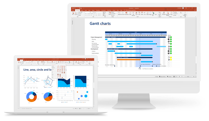
This is exactly where empower® adds value. With the charting software from empower®, you can plan and visualize projects in PowerPoint with polished, presentation-ready results, without the tedious manual effort that native PowerPoint tools often require. Status indicators, responsibilities, vacation calendars, school holiday calendars, and other elements can be added in just a few clicks to make your project plan easier to understand.
How does empower® specifically help with Gantt chart creation?
One major advantage is flexibility:
- You can configure your Gantt chart with a wizard.
- Or you can link it easily to prepared Excel data.
That makes the creation process not only more structured, but also much more practical. Instead of drawing every element manually and then adjusting it again later, you get a cleanly built chart that is easier to maintain and update.
Why is that especially valuable when schedules change?
Because project plans constantly change in real life. Dates move, phases get extended, tasks are added, and priorities shift.
With empower®, your Gantt charts stay:
- easy to update
- consistent
- structured
- and visually reliable, even when schedules change
That is a major practical advantage. The challenge is rarely just creating a good-looking Gantt chart once. The real challenge is keeping it clean and usable as changes continue over time.
What does “presentation-ready” mean in this context?
Here, “presentation-ready” means professionally polished results that are clean, well-structured, and suitable for demanding presentation settings. It means no improvised workarounds, no uneven bars, and no fragile construction, but instead a visual that looks credible and polished.
What are the day-to-day benefits of empower®?
With empower®, teams benefit from:
- faster Gantt chart creation
- less manual formatting
- easier updates
- more consistent results
- higher visual quality
- better scalability across teams
- more reliable charts when schedules change
Why is this especially relevant for companies?
Because Gantt charts in companies are rarely one-time deliverables. They are needed repeatedly for:
- project plans
- transformation programs
- rollout planning
- implementation roadmaps
- client presentations
- internal status updates
When these visuals need to be created regularly, appearance is not the only priority. A dependable process matters just as much. That is where the real value comes from: less effort, fewer errors, more consistency, and better usability in everyday work.
What should a good tool for Gantt Charts in PowerPoint be able to do?
A good tool should do more than produce attractive visuals. It should address the core weaknesses of the native process.
The most important requirements include:
- easy creation without specialized knowledge
- a clean and consistent chart structure
- simple updates when changes occur
- strong integration with prepared data
- brand-compliant and presentation-ready results
- low risk of errors
- meaningful reusability
That is why there is such a significant practical difference between “you can make it work somehow in PowerPoint” and “you can do it professionally and efficiently.”
Conclusion: Is it worth creating Gantt Charts in PowerPoint with empower®?
Yes, especially if Gantt charts are used regularly rather than only occasionally.
A Gantt chart is one of the most effective visuals for presenting project plans clearly. At the same time, creating one natively in PowerPoint is often tedious, error-prone, and difficult to maintain. That is why a more structured and reliable approach is worth it.
With empower®, projects can be planned and visualized in PowerPoint with polished, presentation-ready quality. Gantt charts can be configured with a wizard or linked to prepared Excel data, making them easier to update and more consistent even when schedules change.
The value goes beyond saving time. Equally important are:
-
fewer manual errors
-
higher visual quality
- stronger consistency across teams
-
more professional results
-
and a much more durable workflow
Anyone who regularly presents project plans in PowerPoint needs more than just a chart. They need a reliable way to create and maintain one. empower® provides that support.
FAQ
What is a Gantt chart?
A Gantt chart is a visual representation of a project timeline in which tasks or phases are displayed as bars along a time axis.
What is a Gantt chart used for?
It is used to present project phases, durations, overlaps, milestones, and time-based relationships in a clear and understandable way.
Why is a Gantt chart in PowerPoint often difficult to create?
Because PowerPoint does not offer a native function specialized for project logic, and many elements must be built, aligned, and maintained manually.
When should you use a Gantt chart?
When multiple tasks or project phases need to be shown clearly, structurally, and visually across a defined period of time
Why can a specialized tool make sense?
Because it speeds up creation, reduces errors, simplifies updates, and supports consistent, professional results.

Create a Gantt chart in Excel in 8 steps

Gantt chart examples for your projects