
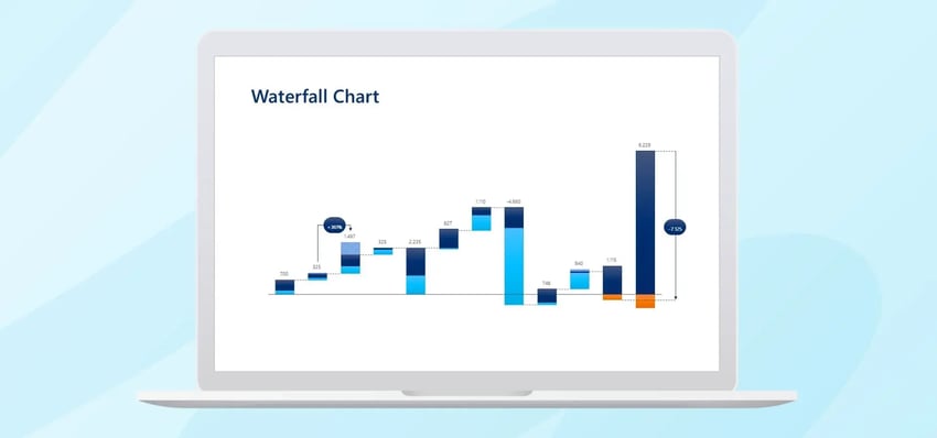
A waterfall chart shows how a starting value evolves into a final result through a series of positive and negative changes. While PowerPoint offers a built-in waterfall chart option, creating one often requires significant manual effort because the logic, labels, and formatting usually have to be adjusted manually. With empower®, waterfall charts can be created much more easily, quickly, and consistently.
Waterfall charts: Use cases, challenges, and practical shortcuts
Anyone who presents numbers in PowerPoint often faces the same challenge. It is not enough to show the final result. The audience also needs to understand how that result was achieved.
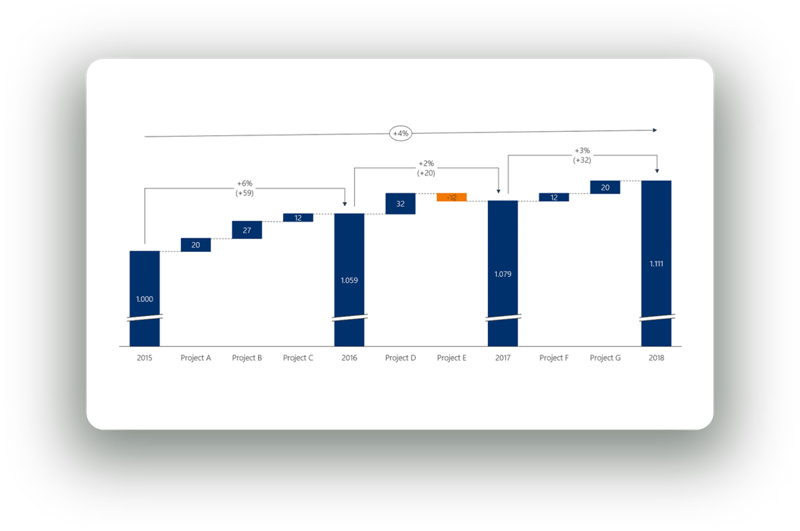
That is exactly where waterfall charts are useful. They clearly illustrate how a starting value changes through positive and negative drivers until it reaches a final result.
This makes them particularly valuable for financial reporting, variance analysis, bridge analyses, and executive presentations.
In practice, however, waterfall charts can be more difficult to create than they initially appear. Bars must be logically structured, intermediate values must be calculated correctly, colors must be applied consistently, and changes must be visually clear. When numbers are updated, multiple people work on a presentation, or brand guidelines must be followed, the effort can quickly become unnecessarily high.
This article explains what a waterfall chart is, when it should be used, how to create one in PowerPoint, which common mistakes occur, and why the process becomes much easier with modern charting add-ins like empower® .
What is a waterfall chart?
A waterfall chart is a chart type that shows how a starting value develops into a final value through individual increases and decreases. Instead of displaying only the result, it visualizes the step-by-step changes that occur along the way.
A typical waterfall chart follows this structure:
- A starting value establishes the initial point.
- Positive and negative changes occur between the start and end.
- A final value shows the result after all changes.
- Each bar builds visually on the previous one, making the development easy to follow.
Because it connects two values and illustrates the factors that caused the change, a waterfall chart is often referred to as a bridge chart.
Key elements of a waterfall chart
A typical waterfall chart includes the following components.
-
Starting value
The initial value from which the analysis begins. -
Intermediate steps
Individual positive or negative drivers that increase or decrease the value. -
Subtotals
Optional intermediate totals that help highlight partial developments. - Final value
The final result after all changes have been applied.
- Connection logic
The bars visually relate to each other so the progression becomes easy to follow.
- Color logic
Positive and negative effects are typically shown in different colors so the direction of change can be recognized immediately.
Questions a Waterfall Chart helps answer
A well-designed waterfall chart typically answers questions such as:
- How did the result come about?
- Which factors had the greatest impact?
- Which effects were positive and which were negative?
- Why does the final value differ from the starting value?
- How is the overall change distributed across individual drivers?
This is particularly valuable in presentations because simply showing a target value is rarely sufficient. Decision-makers often want to understand the drivers behind the number.
When should you use a Waterfall Chart?
A waterfall chart is useful whenever you want to clearly explain the change between two values. It works especially well when multiple factors influence the final result and those factors should be presented in a transparent and structured way.
Typical Use Cases
Waterfall charts are commonly used for:
-
Financial presentations
For example, explaining revenue, profit, or margin development. -
Variance analysis
Showing why actual results differ from planned results. -
Bridge analyses
Explaining changes from last year to the current year or from budget to forecast. -
Executive or board presentations
Making complex financial or operational relationships easier to understand. -
Project or business reviews
Demonstrating which drivers influenced a specific result.
When a waterfall chart is not the right choice
Not every data story requires a waterfall chart. It is less suitable when:
- only a single value needs to be shown
- there is no clear sequence of intermediate changes
- time trends are the primary focus
- proportions or shares are more important than changes
In these cases, other chart types may work better, such as:
- column charts
- line charts
- stacked bar charts
- pie charts
- Gantt charts or timelines
How to create a waterfall chart in PowerPoint?
In practice, there are usually two approaches. You can either use PowerPoint’s built-in chart feature or build the chart manually using shapes. Both approaches are possible, but each has limitations.
Method 1: Creating a Waterfall Chart Using PowerPoint’s Chart Feature
Step 1: Insert a Chart
In PowerPoint, click:
-
Insert
-
Chart
-
Waterfall
PowerPoint will open an embedded Excel sheet or data table where you can enter your values.
Step 2: Enter or Replace Data
- Starting value
- Price increase
- Volume decline
- Additional costs
- Savings
- Final value
The order of your data determines the narrative flow of the chart.

Step 3: Define Totals or Subtotals
PowerPoint must be told when a bar represents a total instead of a change.
To do this:
- Click the chart once.
- Click the specific bar again so only that data point is selected.
- Right-click.
- Select Set as Total.
Without this step, the chart logic may be incorrect.
Step 4: Adjust Colors and Formatting
Typical adjustments include:
- selecting bars
- opening Format Data Series
- assigning colors for positive, negative, and total bars
- adjusting outlines or fills
- showing or hiding axes and gridlines
This is often where detailed formatting work begins.
Step 5: Add Data Labels
To display values directly in the chart:
- select the chart
- open Chart Elements
- enable Data Labels
Labels often require additional manual adjustments, such as position, font size, or color.
Step 6: Clean Up the Chart Design
Finally, many users refine the chart by adjusting:
- chart title
- axis labels
- legend
- spacing
- font sizes
- corporate design colors
- unnecessary visual elements
Only after these adjustments does the chart typically look presentation-ready.

Method 2: Building a Waterfall Chart manually with shapes
Many users create waterfall charts manually using shapes when:
- the layout must be highly customized
- the standard chart appearance is not sufficient
- additional visual elements are required
- strict corporate design guidelines must be followed
This process typically involves:
- Creating gridlines or guides for alignment
- Drawing bars manually using rectangles
- Constructing the correct base position for each bar
- Adding connectors, labels, and annotations
- Grouping the elements to keep the chart organized
However, this method often becomes difficult to maintain when numbers change.
Common mistakes in Waterfall Charts
Typical mistakes include:
- incorrect ordering of drivers
- bars starting from the wrong baseline
- unclear separation between positive and negative values
- too many categories in one chart
- inconsistent colors
- cluttered labels
- very small numbers
- unclear connections between steps
- missing emphasis on start and end values
- excessive manual adjustments when data changes
Why creating Waterfall Charts in PowerPoint can be difficult
Although PowerPoint offers chart tools, it lacks flexible logic specifically designed for complex waterfall charts used in presentations.
Common PowerPoint challenges include:
- PowerPoint does not understand the storytelling logic of the chart
- many formatting steps must be done manually
- updates often trigger additional adjustments
- adding extra information requires workarounds
- label positioning can be difficult
- maintaining consistency across teams is challenging
Why use empower® for Waterfall Charts in PowerPoint?
Creating waterfall charts with native PowerPoint features often requires unnecessary manual work. With the modern charting solution from empower® , charts can be built as quickly as your argument develops.
Instead of assembling charts from individual shapes, guides, and labels, empower® enables users to create waterfall charts in a more structured, efficient, and professional way.
How empower® helps with creating Waterfall Charts
With empower® Chart Creation, waterfall and stacked bar charts can be created quickly and easily.
Key capabilities include:
- easily inserting subtotals for each data series
- combining multiple data series
- displaying multiple waterfall charts within a single diagram
- presenting value development clearly and transparently
- switching chart direction from left-to-right or right-to-left
- creating horizontal waterfall charts
This flexibility is extremely valuable because not every waterfall chart follows the same logic. Different storylines and data structures often require different chart formats.
 Highlighting key insights
A strong waterfall chart does more than display numbers. It highlights the most important insights.
empower® allows users to emphasize key results using features such as:
- total labels
- delta lines
- average lines
- difference arrows
- CAGR indicators
These elements help communicate the core message of the analysis more clearly.
Benefits of using empower®
Teams benefit from:
- faster chart creation
- less manual formatting work
- easier insertion of subtotals and additional elements
- greater flexibility in chart structure
- clearer emphasis on key insights
- well-positioned and automatically updated labels
- fewer errors
- more consistent and professional PowerPoint results
Conclusion: Is it worth creating waterfall charts in PowerPoint using empower®?
Yes, using empower® to create waterfall charts in PowerPoint is especially valuable when these charts are used regularly.
Waterfall charts are one of the most effective ways to explain changes between two values. However, building them with native PowerPoint tools can be time-consuming, error-prone, and difficult to maintain.
empower® simplifies the process and helps teams create clearer, more professional charts faster.
The benefits extend beyond speed. Teams also gain:
- fewer manual errors
- better readability
- higher visual quality
- stronger consistency across presentations
- a more reliable workflow for recurring reports and presentations
Anyone who regularly visualizes financial developments, performance bridges, or variance analyses in PowerPoint needs more than just a chart. They need a reliable way to create it. That is exactly what empower® provides.
FAQ
What is a waterfall chart?
A waterfall chart is a chart type that shows how a starting value changes through individual positive and negative drivers until it reaches a final result.
What is a waterfall chart used for?
It is used to clearly explain the change between two values. Typical use cases include financial analysis, bridge analyses, and variance explanations.
When should you use a waterfall chart?
You should use a waterfall chart when the factors driving a change need to be explained in a logical and visually clear way.
Why is creating a waterfall chart in PowerPoint often time-consuming?
PowerPoint does not provide flexible waterfall chart logic for complex presentation needs. Bars, intermediate values, positions, labels, and updates often have to be created and maintained manually.
Why is empower® useful for waterfall charts in PowerPoint?
empower® allows users to create waterfall charts faster and in a more structured way. It also supports features such as subtotals, combined data series, additional chart markers, and clean labeling.
What is the practical advantage of using empower® ?
empower® reduces manual work, simplifies updates, improves visual quality, and provides a reliable workflow for recurring charts in PowerPoint presentations.

Animate PowerPoint Charts individually with few steps

Convert charts: How to successfully switch PowerPoint chart add-ins