Rebranding without losing identity: how K16 redefines itself and remains authentic
How can a company continuously evolve and still remain authentic? K16, a leading B2B communications agency based in Hamburg, Germany, faced this very challenge. They kicked off 2024 with a rebranding. Over the course of more than 35 years, the company has reinvented itself several times—from digitalization partner to holistic consulting and design partner. But how do you stay true to yourself in an ever-changing industry?
We spoke with Eibo Schulz-Wolfgramm, Managing Director and Founder of K16. He’s been with the company since the beginning and takes us on a journey through multiple rebrandings, strategic transformations, and constant change. Is bold, edgy branding the key to success? And how do you balance old values with new strategies? Here’s an interview about the balancing act between innovation and consistency—and what makes K16 different from other agencies.

Eibo, you’ve been managing director of K16 for over 35 years. How many rebrandings has K16 undergone in that time?
Yes, I’ve been on board for exactly 35 years. I started in 1989 as a student. I’d say we’ve had at least four rebrandings. At the beginning, it was less about corporate design. You had a logo, a name, you picked a color and a font, and that was it. The corporate design approach we know today has evolved over time.
We’ve always tied our corporate design to major strategic changes and milestones, such as major moves. Those types of changes have generally led us to adapt our look to new circumstances. Basically, we’re fans of a fluid corporate design. Not everything needs to be set in stone. We need healthy guidelines within which creativity is possible. That’s always been our approach.
How would you describe the development of K16 over the years?
I’d like to begin this answer with our motivation: What drives us? We always strive for healthy growth. Many people reduce this to numbers. For me, growth also means growing with our employees, our customers, and their needs. We constantly face new challenges that help us grow—and our corporate design grows with us.
When we started, we were primarily a digitization partner for our customers. It was less about design and more about digitizing content. Our first clients—mainly consulting firms—were still working with overhead slides and colored markers. Then suddenly there was the ability to digitize text. For the first ten years of our company’s history, our approach was very service-oriented.
As trust grew, so did complexity. As the demands grew, so did the scope of corporate design and branding.
How do you stay true to the core of who you are on a journey like this?
There are certain core values that you carry with you, both as a person and as a company. This applies to the people in the company as well as our clients. No matter how we present ourselves in terms of design, at the end of the day we have to be true to ourselves, be human and not aloof. It’s ultimately about corporate identity: What values do we embody? How do we present ourselves to the outside world?
What brand values are most important to K16?
We’ve developed a set of values that guide us: down-to-earth, partnership, responsibility, and honesty. These four values are particularly important to us and shape our actions, both internally and externally.
Being down-to-earth may seem boring and uninnovative at first, but it’s critical to truly understanding our clients’ problems and needs.
Partnership means working with our clients—the people—as equals, without hierarchical barriers. We live this partnership not only externally, but also internally by truly caring about the people who work at K16—not just their roles or functions.
Responsibility and honesty go hand in hand. We often deal with confidential client information, which requires the highest level of discretion. In addition, our clients expect us to act responsibly and always do what’s best for them.
What makes K16 different from other agencies? How do you create a unique brand identity?
Everything and nothing, to put it in a nutshell. If you just look at our portfolio, you might think we’re not much different from other agencies.
But we make our customers feel good by truly living our values. For example, some clients call us at 9 p.m. in urgent situations. They know that even in stressful situations, such as before an important event, we’re there to help. Quality and partnership are always our top priorities. Beyond the usual range of services, we take a holistic, often challenging view of our clients’ projects, which has made us a consulting partner. We’re down-to-earth and honest.
Can you give us an example?
We often get requests for a new PowerPoint slide master. However, many times it turns out that the customer needs something completely different. We always try to look at the entire customer journey.
Even if it’s just the slide master, a comprehensive service chain is needed to successfully implement it in the company. The slide master is always a good foundation, a good platform. But how do you communicate the rules or possibilities of the design to the users? Together with our clients, we create guidelines so that all users in the company can immediately communicate within the branding using the new slide master.
This holistic approach and willingness to question requirements makes us a valuable partner for our customers.
Why did you decide to re-brand K16?
The rebranding is closely linked to our strategic transformation. We realized that we needed to communicate more precisely and clearly what services we offer in what areas—our so-called “excellences”.
It was a strategic decision to position ourselves more clearly in the market. As part of this process, it was a logical step to revamp our look and feel. Adjusting our strategy ultimately led to a new brand image.
How do you communicate your values through corporate design?
Corporate design must reflect a company’s values. Companies, their customers, and their employees should ask themselves: where does my design come from?
For me, it has to come from a content-based, strategic, value-driven world to be authentic.

Can you explain that?
Our primary color has always been red. However, in our previous image, we relied heavily on orange and mint green as secondary colors. That led to an inconsistent look to the outside world. As part of our corporate design adjustment, we refocused and made a clear commitment to our primary colors of red, black and white.
We spent a long time trying to find the right shade of red. How positive and bold should it be? How deep should it be to reflect our brand values? It was an intense process. I think our red is perfect for us. It’s striking and memorable. It has a positive energy that describes us well. We also use this color to make strategic accents in our corporate design.

What’s behind the new K16 logo?
I’m particularly proud of the development of our logo. We don’t have just any random logo. It’s important for a logo to tell a story. And that’s exactly what our new logo does. The abstract “K” stands for our three “excellences”.
A central element of our rebranding was to present ourselves as a bold and creative sparring partner. We also focused on dynamic content and changed the way we interact with form and space. Our clients are often on the big stage and love things to move. Our new look is bolder, louder, and edgier. That was our goal.
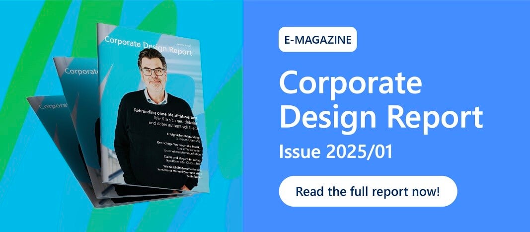
You can find the complete interview in our Corproate Design Report!
You May Also Like
Related articles

Global rebranding strategy in action

Rebranding in Mergers & Acquisitions


