
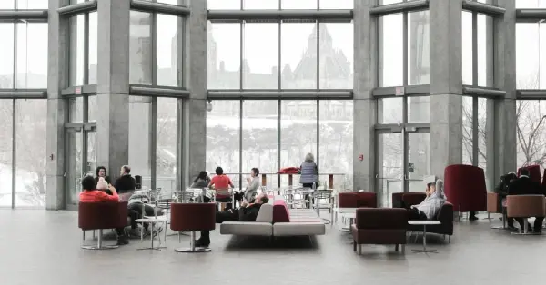
More and more brand messages are reaching us through more and more channels. "Faster, louder, more varied" is the motto of today's brand communication. This development leaves its mark on corporate design.
Florian Schubert, owner of INTO Branding, knows that everything has to be more flexible and still easy to handle. In this interview, he explains how to meet these requirements and why a tight brand corset is no longer in keeping with the times.

At INTO Branding, a corporate design and branding agency in Munich, Florian Schubert supports companies in mastering today's challenges in brand strategy, corporate design, and brand management, and in impressing with a well thought-out brand presence.
Florian, many marketing and branding managers take an increasingly flexible approach to corporate design. What's your experience in this area?
It depends on the use case and the client. We work a lot in the financial sector, where this is perhaps seen in a more classical way. With larger clients and B2C companies, it's completely different.
What do you think is the reason for this development?
Requirements have changed and evolved fundamentally - generally in terms of corporate design and what design is supposed to achieve. In the past, everything was very static. You had a thick set of guidelines, a very regulated design, where all print products were really thought through, with spacing, text sizes and so on. That is certainly still relevant for large companies today.
But aren't these highly regulated designs the exception rather than the rule today?
Channels have evolved, so corporate design has to be much more flexible than it used to be. This also means that companies rely more and more on dynamic visuals. Consumers interact with brands through many more channels, especially in the digital realm. Particularly in social media, you have to communicate louder and in more different ways. You can't operate with a complex set of rules. Today, ideas have to be produced faster and faster, which requires a high degree of flexibility.
Brands can no longer be forced into a straight jacket that considers every application in detail. There are simply too many of them, and communication today has to be more diverse.
How does this affect corporate design?
Design systems that consist of more than a logo and a few colors need to be much more variable. For example, the typography, color scheme, or even the logo will change depending on the context. Perhaps there will be more than one logo. This is an increasingly important development.
What does that mean for your work and your customers?
The challenge for us, but also for our clients, is to develop design systems. Systems that create freedom, but at the same time preserve the core identity. The question is: how much freedom do you give and how many rules do you need? The goal is to ensure that the brand remains recognizable as a whole and can be optimally adapted to the various channels. This means creating a design that remains consistent and recognizable across platforms, from social media to print.
Do you have any tips for implementing such design systems?
Don't leave anything to chance! You should consciously decide how much freedom you want to give. Of course, you can vary this depending on the design concept. It certainly makes sense to use uniform fonts or a uniform logo if the colors are very variable. You can also opt for a consistent, strict visual language, but allow more freedom in other areas.

A branding system has so many screws to turn that it really can be defined very differently from case to case. But be careful. It's all about creating a brand that is both recognizable and can be used across different media in the long term - and above all, that doesn't get boring.
How does this go against the trend of brand simplicity?
A brand always has to be applicable. It depends on the target audience and who is working with the brand. For example, the marketing team or corporate communications can implement the design much more professionally and make better use of complexity or freedom than people who aren't involved in design on a daily basis.
That's why I think it makes sense to reduce complexity. The brand has to be as easy as possible to use in everyday life. It should make work easier, not harder.
Can you give us an example?
An example would be creating high quality documents and presentations that emphasize the professionalism of your thinking. So you have to weigh things up: What is internal communication and what is external communication?
What happens on the website or in social media is usually well thought out. Behind it is a professional team that knows how to play with freedom, but also knows what it's doing.
For example, in my opinion, creating Office templates that are as variable as possible would raise more questions than solve problems in day-to-day use. We also create Office templates, classic master documents. The real question is how well you can use them in your day-to-day work. The choice of fonts plays an important role. You may have to find much more pragmatic solutions here, which may not be as aesthetically pleasing as we would always like, but in case of doubt, anything else makes no sense for the customer or in terms of implementation.
So, you recommend distinguishing between internal and external communication?
Ideally, yes. It's about tailoring the corporate design to the users and their needs.
There are two different audiences. On the one hand, the internal target group is primarily concerned with day-to-day business. Here, it may make sense to take a more relaxed view of brand compliance, since the primary goal is to work efficiently and produce a clean document. Ideally, of course, it supports the brand - or at least doesn't damage it.
On the other hand, external communication through various media should take place within a very controlled framework.
So, it's more about practical application of corporate design than perfection in every detail?
Yes, you could say that. But there's another trend that impacts on implementation and accuracy: the trend towards minimalism in design. A lot of redesigns and new brands are very minimalist - very clean, very simple typography, very clear colors, and a logo that's reduced to a minimum. This principle of minimalism is becoming more and more important in branding.
The challenge is that when you have a very clear, simple design, you have to communicate all the more precisely. If the implementation isn't right, it's immediately noticeable. This is about things like white space, proportions, and font sizes.
There's a fine line between minimalism that looks elegant and minimalism that looks interchangeable. You have to be careful not to reduce the brand to the point where too much of the core is lost. This trend works well with bright colors and a pop imagery style, especially in the digital realm. The important thing is that it is well done, has a strategic basis, and fits the identity of the company or brand. Many developments turn out to be short-term design trends that don't benefit every brand.
Is the trend toward minimalism limited to certain companies or industries?
The trend has been particularly noticeable in the automotive industry, but not to the extent described above. That industry tends to have very well thought out corporate identities with a certain depth to them. The minimalist design can be found especially in SaaS companies and start-ups. The reason for this trend is also better digital presentability.
What's important when it comes to the digital presentation of a design?
The issue of "print versus digital" is particularly important when it comes to color. In the past, the printability of colors was one of the most important requirements. I remember standing in the marketing department of a client in Berlin and checking with Pantone fans and proofs to see if our green was printable. That would be almost unthinkable today.

The digital color spaces that we see on the screen today are much larger than the color space that can be printed in classic four-color printing with cyan, magenta, yellow and black. When producing brochures or trade show booths, colors are mixed from these four inks. This narrows the color palette significantly, meaning that the colors aren't as saturated. Theoretically, you could use Pantone colors, special colors that are precisely mixed and look wonderful in print, but are also extremely expensive.
However, this is no longer as relevant to our customers because they hardly ever use printed products anymore. They are weighing up where they communicate more: digital or print? In most cases, the answer is digital, where the brand is omnipresent. Occasionally, there are still a few brochures, so many make a compromise and choose a color solution that's close to that. Otherwise, the color palette would be too limited.
What do you think are the most important stylistic elements that characterize a design?
I would say: logo, color, font. In that order. Of course, the visual world shouldn't be neglected. I'm a big fan of a consciously defined visual language based on a set of rules that define tonality, color, lighting mood, composition, content, etc.
Again, you have to differentiate from use case to use case. Social media, for example, often offers more creative freedom.
Perhaps even more important, but often underestimated, is tonality. How does the brand feel? How do I communicate? How do I appeal to my target audience? We advocate a holistic approach in which a brand positioning, a specific brand story, is communicated both externally and internally. This is done visually, but of course also through messages and tonality.
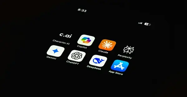
Artificial intelligence is an important topic that can no longer be avoided in the world of images. We also work with AI for our clients and it's proving to be an extremely helpful tool.
Which tool did you use for AI-based image generation? Were you happy with the results?
We worked with Midjourney, among others. It always depends on what your goal is and what results you want to achieve. It's fascinating to see the possibilities that're already available. Once you become familiar with the subject, AI tools are very powerful, even if many things are still limited at the moment and you can clearly see that images have been generated with AI. But if you think about what was possible four years ago and what will be possible four years from now, I expect great things. It will change the industry a lot.
For example, we used AI to create 3D renderings of abstract nature images for clients. The goal was to show the perfection of nature, whether it be ferns, trees, or coral. With the help of AI, we were able to quickly add more variety to the motifs. These are all natural shapes, some of which are based on mathematical formulas. Combining the perfection of nature with a technical component is where we think the use of AI is very relevant.
Are there other use cases?
Another area where AI can be used effectively is in idea generation. For example, if you want to present an ad motif, a key visual, or something similar to a client, a designer could spend half a day Photoshopping ideas. Alternatively, you can use the right prompts and visualize a good idea in no time.
Recently, AI has also become part of Photoshop. If I have an image and I realize that I need more space above a person's head, or that I think the tie is stupid and I would rather have a bow tie, I select the element and ask if I want to change the tie. I then get several suggestions and choose the one I like best. It's incredibly convenient.
How important is it that images are truly unique and not used by others?

Again, there's a distinction to be made. Not every white paper has to contain images that I have taken. However, for recurring key visuals, I prefer to use images that I've taken myself.
Real people always convey a certain authenticity. You can always tell whether it's a stock photo or an original image. You can't really convince with stock photos. It's the office, it's the people. It's the little details that make the difference. If you have the budget and the desire to convey authenticity, I would definitely recommend a shoot.
Is this a recommendation for shooting with people from your own company?
Large companies don't necessarily have to represent their employees. The focus and standing is different. It's not about saying: "Hey, we're company XY, we're a great community and we build great products." But with startups, SMEs, or service providers, the people are usually behind the product, or the people are the product. If you're trying to portray something that's obviously not true, you're going to get a big headache from the audience.
How do you ensure that only corporate images are used in the office? How can AI help?
There are already brand management portals that aim to simplify the brand-compliant use of content. You at empower® are one of them when it comes to Microsoft Office.
It's all about image database management and integrated policies. AI also plays an important role here - integrated AI that generates images or pictograms according to corporate guidelines. I see a lot of potential here. This may not be a positive development for the photography industry, because customers are less and less understanding why they should pay for a shoot when they can get stock or AI photos cheaper, even if the quality is not always comparable. However, if you search long enough, you can usually find something suitable - especially if you invest a little more money in higher quality image databases. This is often still cheaper than the cost of a photo shoot.
When could such AI solutions for image generation become standard?
There's still a lot of work to be done. With AI, you don't automatically get perfect results. There's a certain level of complexity involved, probably similar to that of a photographer. Also a lot of issues need to be addressed, especially around copyright. In addition, many results are far from usable. Many details in the image often aren't correct; for example, on closer inspection, you can see that the people in the image have six fingers.
Finally, the fundamental question is: What are the implications of deviations or inconsistencies in the corporate design? When does it become critical?
It becomes critical when it's unintentional and deviations lead to inconsistent brand experiences that dilute the brand image and leave an unprofessional impression.
Every customer touchpoint is important in creating a level of consistency. That doesn't mean everything has to look the same, but it does mean it has to be well thought out and not left to chance. Everything else can be seen and felt. At the end of the day, the brand depends on the gut feeling that remains.
What do you think the actual damage is?

It can't be measured because it's mostly a gut feeling. If a highly professional product based on reliability is perceived as a botch at many points of contact, that creates a gap in the mind that affects the image and impression of the product.
Let's take this a step further: you get an unprofessional presentation, the business card you receive looks cheap, the booth at the trade show is a run-of-the-mill booth with a cheesy claim, and the website isn't well thought out. One thing leads to another, and each time the trust in the brand is weakened a little more.
A lot happens in the subconscious and in the gut. However, I'm convinced that it's the many small details that make all the difference.

Brand integrity in Microsoft 365: Strong brands start in employees' everyday lives
AI in PowerPoint: The real effort and how to use it intelligently