
Branding is so much more than a logo or a color code – it’s a journey through which a company becomes a distinctive brand! It’s about creating a strong and recognizable identity that runs like a thread through all of a company’s communications – a true hallmark. However, even the best brands can lose impact if basic principles or guidelines are neglected, and individual touchpoints, such as business documents, often stray from the brand image.
All the more reason to follow these tips! We'll show you how to avoid common branding mistakes when creating business documents so that they seamlessly integrate with your brand communications.
#1: Failure to establish brand guidelines
Brand guidelines are essential to a smooth design and communication process. They ensure that everyone is on the same page and no one is reinventing the wheel. This allows everyone to focus on what they do best. Without brand guidelines, uncertainty and redundant work are inevitable as iterations and feedback loops are required to ensure a brand-compliant look. The result: an inconsistent brand experience that weakens brand perception. Without clear guidelines, the company loses profile, trust, and efficiency.
 #2: Blind reuse of existing slides
Who hasn‘t done it? Quickly copying a slide from an old presentation to save time, only to realize too late that the content is outdated. Outdated content can lead to misunderstandings and poor decision making. What‘s more, it can be aesthetically unpleasing, as outdated designs in presentations look unprofessional and fall short of current standards. Especially if brand guidelines have been updated, be careful when reusing existing slides. They are often out of date because no one has updated them.

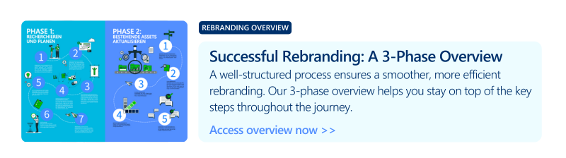
#3: Inconsistent implementation of a rebranding
Inconsistent implementation of a rebranding is most evident when existing content isn‘t revised and adapted to the new design. For example, while the website may feature the new logo and colors, reports, contract documents, and sales presentations often retain the old look and feel.
In addition, outdated assets such as logos, icons, and other graphic elements aren’t consistently archived or deleted and are often unknowingly reused, especially if employees have saved them locally. Team training is also often neglected. Lack of clarity about the new policies and how to apply them adds to the confusion. Protect your efforts with specialized brand asset management software and ensure that only current brand assets are used!
#4: Overusing colors in PowerPoint
Creativity and variety are important, no doubt. But when chaos and inconsistency take over, the impact suffers – and that‘s something to avoid! PowerPoint presentations, in particular, encourage creative freedom. But corporate colors exist for a reason. They ensure that the brand is recognizable across all communication channels and convey a consistent visual identity.
Make sure your employees understand the importance of corporate colors. Support them with practical tools and templates that make it easy to apply corporate colors quickly and accurately. Inconsistent design reduces brand recognition-and no one wants that, right?
#5: Ignore templates in favor of custom formatting
Templates and well-thought-out formatting guidelines are the key to a professional and efficient presentation! When everyone consistently follows these guidelines, presentations will impress with consistent and skillful placement of headings, text, tables, and images.
 Ignoring templates not only jeopardizes a consistent look and feel, but also wastes time with manual, time-consuming formatting. Templates and guidelines are a must for efficiency and consistency - and for the success of your presentation!
#6: Neglecting email signatures
Get the most out of your email signature! Say goodbye to freestyle and individual interpretations of logos or titles. Opt for consistent, professional signatures that reinforce your brand and create a unified look. An email signature is an excellent tool for demonstrating professionalism and ensuring that recipients receive all relevant (legal) information.

Email signatures also offer the opportunity to place targeted messages, such as banners promoting events, webinars, or new products.
#7: Get crazy with fonts and sizes
Every brand has a defined visual identity, and the corporate font is a central part of it! However, when corporate fonts are unknown or not implemented in relevant applications, the first available alternative is often used. Different fonts and sizes in presentations look cluttered and unprofessional.
#8: Rely on Google Image Search
Images in presentations are critical! They can bring a presentation to life and make all the difference. A quick image search on the Internet may seem like the easiest solution. But beware: many images on the Internet are copyrighted. Using these images without permission can have legal consequences. In addition, images found online often don‘t meet brand guidelines. Instead, make professional, licensed images available directly from within Microsoft 365!
#9: Randomize charts and graphs
Colors and shapes in charts are excellent tools for presenting information in a visually appealing and memorable way. But striking the right balance between detail, color, and effort is critical. A haphazard approach wastes time and damages the brand. Standardized, brand-compliant chart templates ensure that everyone in the organization can present information quickly and easily.
#10: Neglecting company-specific writing styles
Company specific writing styles for product and brand names are an important part of corporate identity. In large organizations, these details are often numerous and difficult to remember, leading to frequent errors. These mistakes make the company look unprofessional and give the impression of a lack of attention to detail or internal alignment.
Not only is it often impossible to remember all the styles, but it takes time to apply and review them consistently. Overview, training, and tools can help you apply them.


5 steps to brand-compliant Microsoft Office documents

Your guide to successful brand management