
Rebranding ranges from the look and feel of a company's individual brands to the restructuring of its entire corporate identity. In this article, we present three rebranding examples that illustrate why rebranding is necessary, its potential pitfalls, and how technology can help streamline the process.
Rebranding examples from the real world
Suitable rebranding at the right time provides many opportunities. Your brand can be modernized, your external image adapted, and your corporate identity revised. The rebranding process should always be well thought out - an ill-considered rebranding can damage your brand. This article shows you some examples of what rebrandings can look like and how they can overcome the challenges that arise.

Microsoft
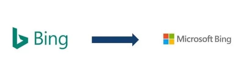
Looking at Microsoft, it's clear that rebranding doesn't always require a complete restructuring of external communications. For example, Microsoft renamed its search engine from "Bing" to "Microsoft Bing" in 2020, making it clear that the search engine belonged to the Microsoft group. At the same time, they adjusted the product logo to better fit Microsoft's corporate design. This rebranding example was quiet, so it was not explicitly communicated by Microsoft. The logo is very close to the logo of the entire corporation and thus fits seamlessly and unobtrusively into the corporate design. However, the logo’s stylized lowercase "b", a previously central identifying feature and design element, disappeared.
It’s not only with Bing that we can see a trend towards emphasizing Microsoft as a brand. In 2020, Microsoft's productivity solution was also rebranded from "Office 365" to "Microsoft 365". However, since Office 365 is a service with paying users, Microsoft communicated this rebranding publicly. Microsoft also restructured its general range of services so that Microsoft 365 offers additional functions compared to Office 365.
In addition to individual brands and services, the Microsoft logo itself has changed over the years. Here, the necessity of rebranding becomes very clear: the original company logo from the 70s would simply no longer fit the innovative technology company of today.
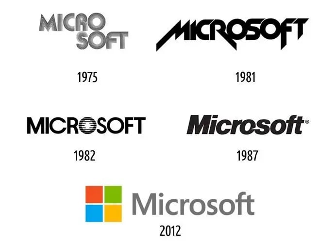
(source: logomyway.com)
A rebranding failure: Tropicana
Tropicana demonstrates that rebranding is always a risk. Tropicana is a brand of PepsiCo and is mainly known for its orange juice. In early 2009, they decided to change the print on the beverage carton for the North American market. The iconic design of an orange with a straw was replaced with a more modern, minimalist look.
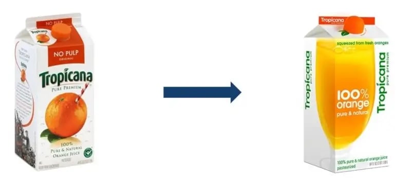
The image shows that many of the established design elements changed as part of the rebranding. The orange with a straw was replaced by a glass of orange juice, the brand name got a new font and was rotated by 90°. The classic orange was revisited in the new cap but was much more inconspicuous than before. So, many iconic design elements were replaced at once. This caused many customers to lose their connection to the brand, as they no longer associated the new carton with Tropicana.
In the weeks that followed, sales of the brand dropped by 20%, resulting in a loss of $20-30 million. Besides that, the rebranding itself and the related marketing campaign cost $35 million. After two months with the new design, management decided to return to the old design.
This rebranding failure shows why a rebranding must be well thought out to avoid severe consequences.
Merck: a successful rebranding example
As a final example, we highlight the rebranding of the chemical and pharmaceutical company Merck. In 2015, the company decided to overhaul its entire brand identity. The idea was to represent the transformation of the company from a classic chemical and pharmaceutical company to a global science and technology group. To this end, outdated elements were removed and replaced with younger, eye-catching elements to further strengthen the "Merck" brand name.
With such a massive rebranding example, there are of course many administrative challenges. Among other things, a new logo, new colors, and new templates were introduced. Countless documents, files and presentations had to be updated with the new design to ensure a consistent corporate identity. And of course, employees had to apply the new design appropriately.
Successful rebranding with empower®
Merck decided to work with empower® to provide its employees with an intuitive tool that guarantees the correct implementation of the rebranding in all presentations. Why Merck KGaA chose empower® is best explained by Brigitte Schneider (Head of Brand Design at Merck KGaA) herself:

empower® supported Merck as a user-focused rebranding tool. empower® ensures that new design decisions are implemented quickly and sustainably.
If you are planning a rebrand or looking for a tool to ensure consistent design in your documents, we will be happy to support you. Start now with empower®.
You can find more information in our rebranding guide.

Rebranding in Mergers & Acquisitions

Rebranding strategy – what you should consider