Fonts play a critical role in the world of design and visual communication. Much more than just letters and symbols, fonts form an integral part of a company's identity. How companies present their messages and how they're perceived by customers often depends heavily on the typeface they choose. So the decision to change a company's standard typeface should be carefully considered, as it affects the overall visual aesthetic and brand identity.
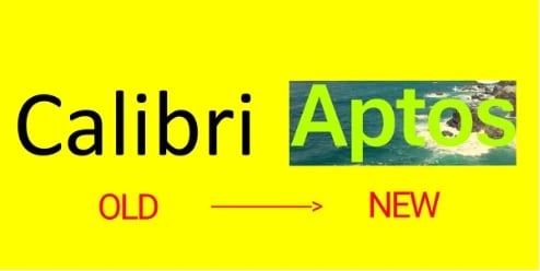
We recently saw one such change of great significance: Microsoft, which has used Calibri as part of its visual identity for years, announced that it is replacing it with Aptos as the new default font in the operating system and related applications. The implementation has been in effect since July 2023.
To understand the implications of this decision, it's important to first understand what fonts actually do.
See how fonts work
The main function of a font is to make text readable. A well-designed font with clear letters and sufficient contrast improves legibility and makes content easier to understand.
Typefaces convey different emotions or moods. For example, sans serif, clean fonts often appear modern and businesslike, while elaborate or cursive fonts can create a playful or creative atmosphere. Some fonts convey a sense of seriousness and professionalism, while others are perceived as informal or less professional. The right choice of font subtly yet profoundly affects the credibility and persuasiveness of a text.
Choosing a specific typeface is integral to a consistent brand identity. Companies often use a specific typeface to represent their brand and ensure visual consistency across different media. Font selection can also help appeal to a specific target audience. Certain fonts may be more appropriate than others for different age groups, cultures, or industries.
Calibri - a well established standard font
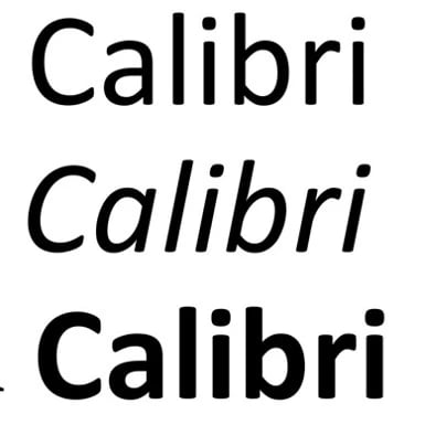
Calibri has been Microsoft's default font since 2007 in each Microsoft 365 application. Calibri is a sans serif, neutral font without any strongly dominant emotion or mood. Its clean appearance and clear lines result in Calibri being associated with a professional look.
(source: The New York Times)
Some critics complain that Calibri lacks uniqueness and personality due to its widespread use as a default typeface. In some design contexts, the font can be perceived as too ordinary or bland.
Why is Microsoft replacing Calibri?
Technology constantly evolves, and fonts evolve with it. Fonts must work perfectly on high-resolution and often very small screens. In practice, Microsoft has found that Calibri doesn't always work best.
In July 2023, Microsoft announced that it would no longer use Calibri as its default font. However, the replacement process began much earlier. In 2021, Microsoft developed and integrated 5 new fonts into its applications: Bierstadt, Grandview, Seaford, Skeena, and Tenorite. The fonts were then tested by users over an extended period of time: The winner: Bierstadt. In the process, the font was also renamed - it's now called Aptos, named after the Californian town that's also designer Steve Matteson''s favorite place.
The other fonts haven't disappeared completely. Grandview, Seaford, Skeena, and Tenorite remain in the drop-down menu, and Calibri even remains pinned to the drop-down menu.
By the way: in addition to a new default font, Microsoft is introducing a new Office design that includes a new default color palette to make Microsoft applications more accessible and modern.
Aptos - the new era of typography
Aptos is also a sans serif font. It's statically grotesque, just like Helvetica. The designer commissioned by Microsoft, Steve Matteson, is none other than the inventor of Segoe - our house font at empower® and the Windows system font since Windows 10.
Aptos is based on 20th century Swiss typography and consists of various geometric shapes.
(source: Business Insider)
The thicker stroke, balanced proportions, and circular squares within the letter contours make the type easier to read, especially at small sizes. Smaller elements also contribute to legibility, such as an appendage on the lowercase L to distinguish it from the capital i.
Aptos embodies professionalism, adaptability, clarity, and modernity, making it a perfect fit for the new Office design. The typeface looks fresher and offers a higher aesthetic.
Factors to consider when selecting a new default font
Implementing a new typeface is more than just replacing fonts. It's a strategic decision that requires careful consideration, research, and a thorough understanding of the brand. This decision has a major impact on corporate identity.
Are you rethinking your default font? Perhaps as part of a corporate design relaunch? If so, you should consider several factors when choosing a new typeface.
- Target audience and usage context: The font should be appropriate for the audience and meet the specific needs of the context in which it‘ll be used. Certain fonts may be more appropriate for formal documents, websites, mobile applications, or artistic projects.
- Readability and versatility: The font's legibility at different sizes and on different screens or print media is critical. A versatile typeface that works well in a variety of contexts is often preferred.
- Brand identity and values: The typeface should reflect the company's brand identity and values. It should reinforce the brand's attributes.
- Technical issues and licenses: It's important to ensure that the chosen font is technically feasible and has the necessary licenses, especially when used commercially.
- Design trends and timelessness: The typeface should be in tune with current design trends, and also have a timeless quality to keep it relevant in the future. After all, you don't want to change your default typeface every few years.
- Consistency and interoperability: When introducing the font into an existing system, ensure that it works well with existing fonts and design elements and doesn't cause compatibility issues.
- User feedback and testing: Feedback from potential users and testing the font in different environments helps assess its acceptance and suitability. This is how Microsoft chose its font.
- Adaptability and support for languages and characters: Ideally, the font should support a variety of languages and characters, and be adaptable to different writing systems as needed. This is especially important for international companies.
With empower® Brand Control, you always use the right font directly in your Microsoft documents and presentations. You save time searching for the right font in the right format. And if you ever deviate from your default font, our design check will alert you and automatically make a correction. Focus on the content - empower® does the rest!
Still have questions? Contact us and we will be happy to answer your questions.

Separation of Microsoft Teams and Microsoft 365: background and implications

5 steps to brand-compliant Microsoft Office documents