
Creating professional communication design in PowerPoint isn’t just about luck. But many professionals have to craft persuasive presentations without any formal design training or knowledge - a task that often proves difficult. This article highlights the key principles of great presentation design and offers tips on using PowerPoint to make your message visually impactful.
Can you create impressive presentations without PowerPoint skills?
In many professions, training is a given - but this is often overlooked for presentations. You wouldn’t ask someone without carpentry experience to build a cabinet, yet every day in offices, people are expected to craft impressive presentations without any graphic design or PowerPoint training.
The result? Cluttered slides, inconsistent designs, and communication that often confuses more than it convinces. Visual communication is now a critical success factor - not just in marketing and sales, but in any role where ideas and results need to be shared effectively.
This article explores the foundations of communication design in PowerPoint. You’ll discover how to structure content visually using the C.R.A.P. principles and learn simple strategies to create slides that truly stand out.
What makes a great slide?
A great slide is more than just text and images - it’s a tool for effective communication. To create impactful slides, focus on these essential features:
- Clear headline: A strong, concise headline highlights the slide’s main message and captures the audience’s attention.
- Core messages: Keep the content sharp and straightforward, avoiding distractions from unnecessary details.
- Visual elements: Use images and charts to clarify your points, make your message memorable, evoke emotions, and present data in a visually compelling way.

"As much as necessary, as little as possible"
Minimalism is key. Focus on the essentials and keep your slides streamlined to highlight the most important information. Overcrowded slides dilute your message and distract your audience.
A useful strategy is the "Storage Principle." Think of it like storing old chairs in the basement for unexpected guests - you keep them handy but out of sight. Similarly, move important but non-critical details off your slides and into presentation notes.
This way, your slides focus only on the core points, making your presentation look polished and professional. You can share the additional information verbally during your talk or provide it later as a handout. This keeps your presentation clean and organized while ensuring all key information is accessible.
Practical tip: Make the most of icons
Icons are a powerful tool for simplifying complex ideas and keeping your content concise. They enhance clarity, draw attention, and make your slides more visually engaging. Take advantage of PowerPoint’s built-in icon library to find clear, professional symbols that elevate your presentation.
Design: More than just looks
Steve Jobs famously said, “Design is not what it looks and feels like; design is how it works.” This mindset should guide your slide design as well.
Rule #1: Every element on your slide must have a purpose
If an element on your slide doesn’t have a clear purpose, remove it. Each piece of text, image, or diagram should directly support your message. Keeping your slides focused ensures clarity and minimizes distractions. Take a moment to review your slides and ask yourself: Does every element add value to my message?
What purpose do visualizations serve?
Visual elements like images are essential in any effective presentation. They:
-
Simplify complex ideas: Charts and icons make abstract data or processes easier to grasp. For instance, a bar chart conveys information much faster than a long list of numbers.
-
Evoke emotions: Images add an emotional layer to your message. In a presentation about ocean pollution, a photo of marine plastic or a trapped sea turtle can forge a powerful emotional connection that stays with your audience.
-
Build shared understanding: Pictures align diverse mental images. Mentioning a “house” might bring to mind a cozy cottage for one person and a grand mansion for another. Showing a picture ensures everyone envisions the same thing, starting from a common perspective. By leveraging visuals effectively, you can enhance clarity, engagement, and connection in your presentations.
Caution when using images
- Images should enhance, not distract: Overly colorful or cluttered visuals can overwhelm your slides without providing meaningful or explanatory value.
- Keep the focus on the speaker and the message: Use images to support, clarify, or illustrate your key points.
- Every image must serve a clear purpose or add value to your presentation.
If a graphic doesn’t meet any of these standards, remove it. Instead, select visuals that strengthen your message and maintain clarity.

The C.R.A.P. rule: A guide to effective slide design
The C.R.A.P. principle - Contrast, Repetition, Alignment, and Proximity - is a powerful framework for creating visually appealing slides. Here’s how to use the first element, Contrast, effectively:
1. Contrast
Leverage contrast to make key elements stand out. For example:
- Size contrasts: Large headlines draw attention compared to smaller body text.
- Color contrasts: Use light text on dark backgrounds or dark text on light backgrounds for better readability.
Bold, colorful, or prominently sized text naturally captures the audience’s attention first. By applying contrast strategically, you can guide your viewers’ eyes from top left to bottom right, establishing a clear and professional visual flow.
 The previous example showed how to apply the Contrast principle.
2. Repetition
Using consistent colors, fonts, and layouts creates a unified design. This consistency helps your audience follow your presentation more easily and makes your work look professional:
- Always use the same fonts, color schemes, and icons throughout your slides.
- Keep text and images evenly spaced on every slide. Whenever possible, maintain the same distance from the edges.
- Use PowerPoint’s Slide Sorter view to review your slides and ensure consistency.
Thoughtful repetition doesn’t make your presentation dull - it makes it coherent and easy to follow.
Pro tip: Easy format copying
-
Select an element, press Ctrl+C, then Shift+Ctrl+V to paste its formatting onto another element.
-
Creating Color Schemes
Choose a color palette that fits your presentation’s theme and stick to it.
 The image above shows the uniform shapes, fonts, and side margins that help the overall presentation appear more cohesive.
3. Alignment
Proper alignment enhances visual appeal and makes content easier to read:
- Use guides and alignment tools available in PowerPoint.
- Arrange elements so they form clear edges and straight lines.
Make sure text, images, and graphics are neatly and consistently aligned.
 This image clearly demonstrates the precise alignment of images and captions, made possible by PowerPoint’s built-in guides.
 That's how it looks if the principle is not followed by the way.
4. Proximity
Group related elements together. Elements placed close to each other are seen as belonging together. This enhances comprehension and creates a logical structure.
- Avoid large gaps between text and the images they relate to.
- Pay close attention to line breaks. Using hard and soft line breaks (Shift+Enter) can improve readability.
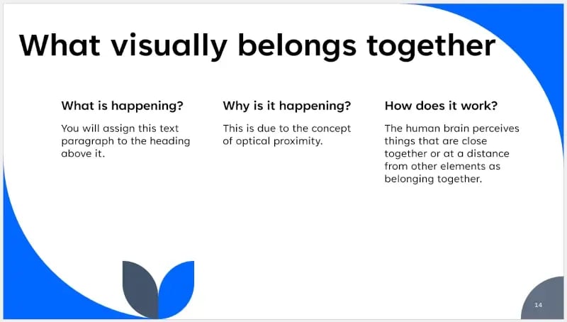
Visual proximity clearly demonstrates that a headline and text, an image and its caption, or diagrams belong together.
The path to the perfect presentation is mastery through practice
The tips presented here are simple to implement when practiced step by step. Begin with small adjustments: improved visuals, stronger contrasts, and optimized alignment.
A tool like empower® for PowerPoint can help you realize these principles more quickly and produce professional results. It offers a wide variety of templates and formatting tools, supports consistent design guidelines, and simplifies the management of corporate design standards. With the right strategy and smart tools, you’ll create presentations that not only look impressive but also make a lasting impact.
Are you ready to transform your next presentation? Start today!


Excel-linked charts in PowerPoint

Creating Marimekko Charts in PowerPoint: Visualize segments and categories