
A Marimekko chart displays an overall picture with multiple variables at a glance. For example, a Marimekko chart can show a company's sales per product and per region at the same time. We will show you how to present data clearly in a Marimekko chart with examples. You will also learn how to create a Marimekko chart in PowerPoint and how to highlight the key message of your chart.
What do Marimekko charts illustrate?
Marimekko charts (also known as Mekko charts or mosaic plots) are used to illustrate multi-dimensional, part-to-whole relationships within categorical data. Unlike standard stacked bar charts that only show percentage composition, Marimekko charts represent data using both variable column width and variable segment height, encoding three dimensions in a single view.
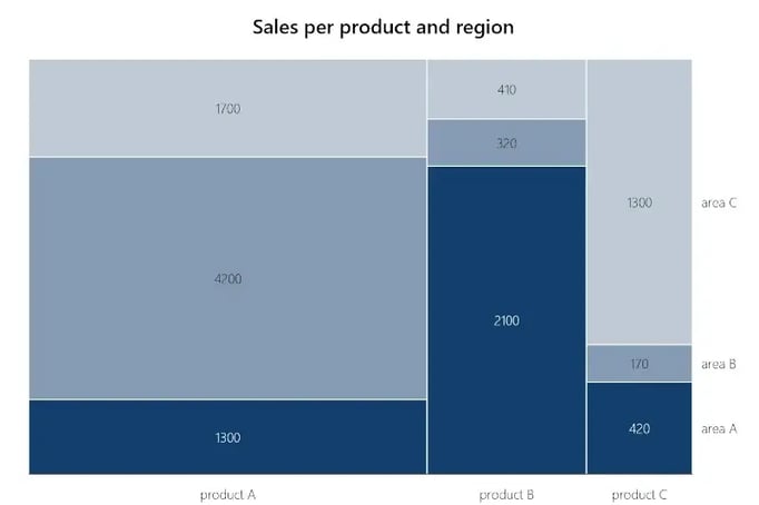
If you want to show sales per product, per region/area, you can use a Marimekko chart to show each region, each product, and their respective sales all at once.
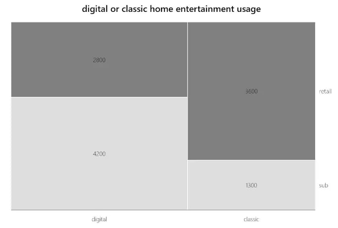
You can also mix completely different data, like digital or classic home entertainment usage: your categories could be Digital and Classic in relation to Streaming Subscription or Purchase.
Are there differences between Mekko charts, Marimekko charts and the PowerPoint Treemap?
Before we show you how to create a Mekko chart in PowerPoint, we want to clarify the different terms. Both the Marimekko chart and the PowerPoint Treemap count as Mekko charts. But there are differences between the two.
The Marimekko chart consists of bar charts stacked side by side, with each axis representing 100%. Products A, B, and C add up to 100% of sales of all products and Areas A, B, and C constitute 100% of sales of all regions. In this example, you can see that Product A has the most revenue because the bar is the widest.
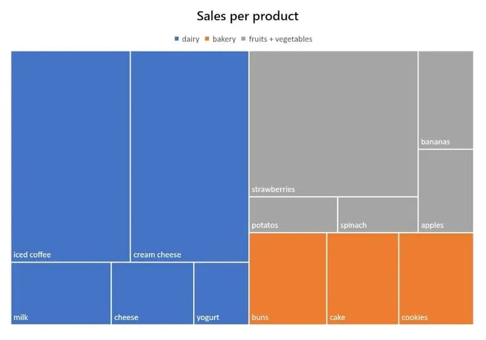
In a Treemap chart, the sheets are not stacked but arranged side by side within a category. With a Treemap, only categories and subcategories are compared with each other. In addition, no values are displayed, which you must insert manually in the settings.
Which type of Mekko chart is most suitable for you is up to you. Both native Treemap charts and Marimekko charts can be created directly in PowerPoint. You can create them and other diagrams without dedicated charting software or save yourself time with the PowerPoint add-in empower®.
Manual method: How to create a Marimekko Chart in 10 steps
- Convert your data sets into percentages.
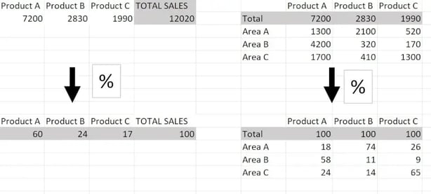
- Just for this exercise create a table in Excel with 100 rows where product A takes up 60 rows because it has 60% of sales.
- Insert as many columns as you need to include your subcategories (Online Sales, Store Sales). Then for Product A enter all the data in percentages and copy them 60 times into the Product A rows. Do this for each category.
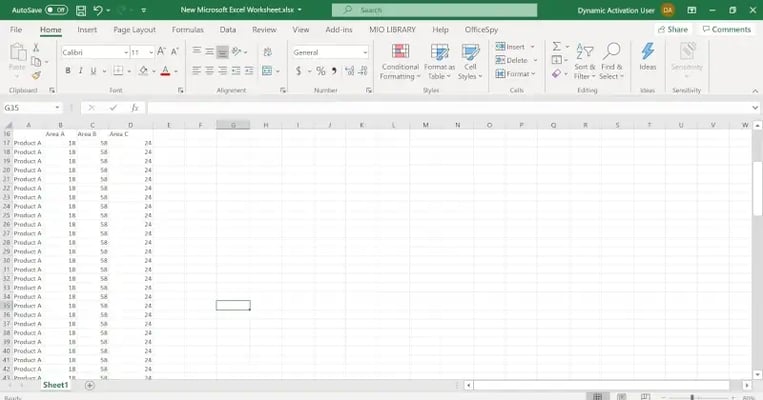
- Select the new table and choose the "Stacked columns" option.
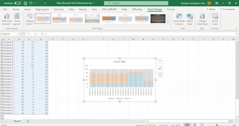
- Copy the chart and paste it into PowerPoint.
- Click with the right mouse button on a column and then on Edit data series.
- Enter the number 0 in the "Distance width" area.
- Click on the vertical axis and enter the value 100 in the "Maximum" field.
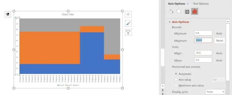
- Delete all duplicate product names on the X-axis.
- To look more like a Marimekko chart, click on the legend and then also "place right".

Streamlined method: How to create a Marimekko chart with just a few clicks
The PowerPoint add-in empower® saves you valuable time when creating and formatting a Marimekko chart. In less than a minute you can create the chart with correct formatting directly in PowerPoint.
Just click on Insert, Chart, and Marimekko in the empower® ribbon: you have created your chart! Above the Marimekko chart, you can link your chart directly to existing Excel data.
How to highlight your Mekko chart’s message
Your presentation can benefit from an easy-to-understand but highly meaningful Marimekko chart. In the following section, you will learn about quality-enhancing chart formatting from empower® to highlight the key messages of your data.
- Use arrows to show trends
Focus visualization of your values’ growth behavior using automatically generated arrows above and beside the Marimekko chart.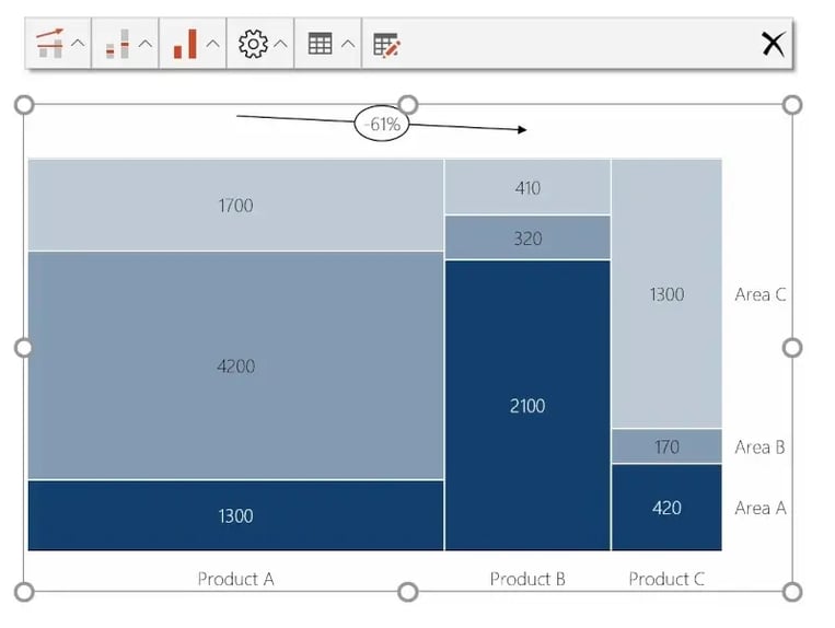
(This formatting is located directly above the chart)
Just click directly above the chart in the leftmost field and choose under Growth Arrows, CAGR Arrows, or Delta Lines depending on what kind of growth you want to highlight with an arrow. - Sum label directly above a category
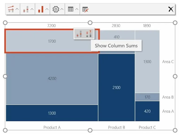
(Insert totals with a double click on the respective category)
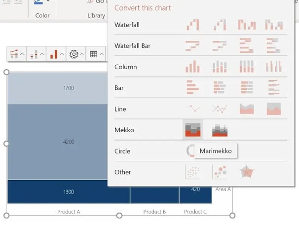
You can also generate some labels directly above the chart in the second box from the left with a few clicks. - Make differences in your values more obvious with a column Mekko
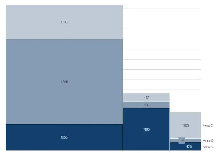
You can convert the Marimekko chart to a Column Mekko with 4 clicks directly above the chart. First, click on the chart you want to convert. Secondly, click on the third box directly above the chart. Then click on “convert this chart” and at last click on mekko chart and you are good.
Is there an easy way to create charts like the Marimekko chart in PowerPoint?
Yes, you can quickly and easily create Marimekko charts with specialized chart add-ins like empower®. The add-in includes all key business chart types – from waterfall and Gantt to Mekko and combination charts. Here is a list of the most useful PowerPoint charts.
empower® Chart Creation makes it easy to create complex charts and reports in PowerPoint – consistently, efficiently, and without manual formatting. Automation, Excel integration, and clean design deliver professional results in minutes instead of hours.
You can find all information about empower® on our website.

A List of the most useful PowerPoint charts

Creating Gantt Charts in PowerPoint for clear and professional project planning