
How to effectively present information on management slides
To visualize business information effectively in PowerPoint, it is essential to make the key message easy to understand at a glance. This is not about showing as much data as possible. Instead, it requires focus, clear visual hierarchy, and charts that match the specific question.
Why are technically correct charts often hard to understand?
Many slides do not fail because of incorrect data, but because of how the data is presented. They may be technically accurate but lack clarity in communication. This is common in business presentations, where numbers, categories, trends, and status updates are shown in full but not structured in a way that makes the core message immediately clear.
The issue is not a lack of content but a lack of prioritization. When everything appears equally important, nothing stands out. Too many colors, excessive data points, long legends, crowded tables, and complex charts slow down understanding. This is especially critical in management meetings, reporting, and project updates, where time is limited and insights must be understood quickly.
Effective business slides answer a different question. They focus on what the audience needs to understand in that moment, not what could be shown. A structured approach to selecting the right visualization can help determine which charts best fit specific business situations in PowerPoint.
3 principles that make business information clearer in PowerPoint
Clear business communication in PowerPoint follows a few simple but powerful principles.
-
Focus on the message first
The starting point is not a visually appealing chart, but the intended message. Whether the goal is comparison, trend analysis, distribution, or status, the purpose defines the visualization. The chart is a tool, not the starting point. -
Condense content strategically
Strong slides do not show everything. They highlight what matters most. Information is condensed so patterns, differences, and priorities are easy to identify. A clear visual hierarchy ensures that the main takeaway stands out immediately, while supporting details remain secondary. -
Design for quick understanding
Readability takes priority over decoration. Clean design, intentional use of color, and avoiding unnecessary visual effects reduce distractions. A strong slide can be understood within seconds and communicates its core message without effort.
How to design management, reporting, and project slides
Not every business slide follows the same logic. Management, reporting, and project slides have different goals and require different levels of detail. The key is always to make the most relevant information easy to grasp.
Case 1: Management slides focus on decisions and relevance
Management slides must quickly highlight opportunities, risks, trends, and required actions.
They should be highly condensed. The key message belongs in the headline. Charts should only include what is necessary for decision-making. Anything not directly relevant should be reduced or moved elsewhere.
Suitable formats:
- Bar charts for comparisons and priorities
- Donut charts for high-level distributions
- Status indicators or KPI tiles for performance tracking
Teams preparing KPIs for executive audiences can take this a step further with the article on which chart types work best forKPI reports in PowerPoint.
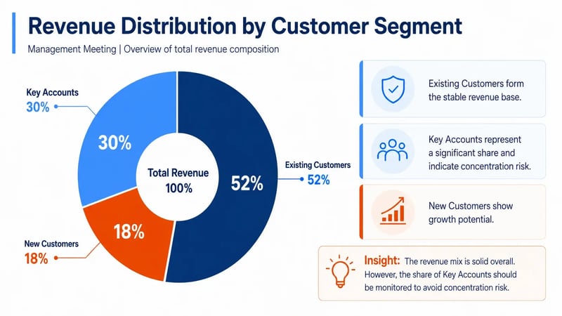
Use case:
A sales director presents the revenue split across current customers, new customers, and key accounts in a management meeting. A donut chart works especially well in this case because it shows concentrations and dependencies faster than a table and makes the total revenue distribution easy to understand at a glance. As a result, management can immediately see whether the revenue base is balanced or whether certain customer groups have too much influence on the business.
Case 2: Reporting slides highlight trends and insights
Reporting focuses on understanding development over time. These slides require more detail than management slides but must remain clear.
The goal is to make trends, deviations, and relationships easy to read. Instead of listing many individual values, reporting should highlight key patterns. Where are the changes. What deviates from the target. What remains stable. Strong reporting connects data to insight.
Suitable formats:
- Line charts for trends over time
- Bar or column charts for actual versus target comparisons
- Stacked columns for composition
- Waterfall charts for changes between a starting point and a result
Variance analyses are especially useful when presentations make plan-versus-actual differences easy to understand.
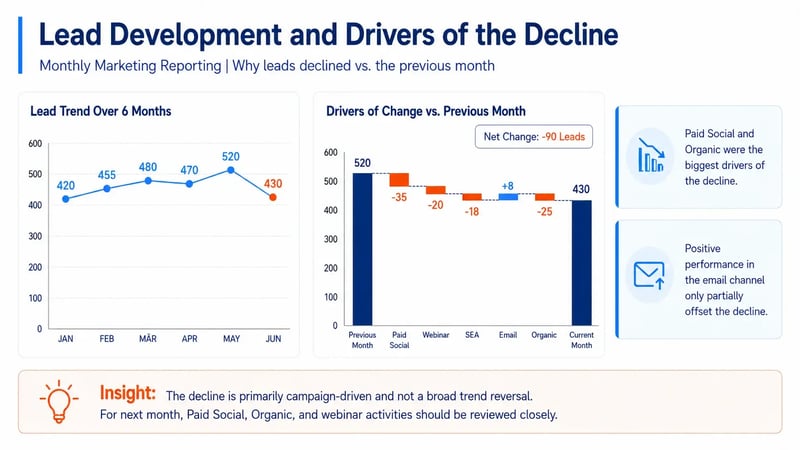
Use case:
A monthly marketing report needs to explain why lead volume declined compared with the previous month. Instead of simply listing numbers in a table, the slide uses a line chart to show the six-month trend and a waterfall chart to show which campaigns or channels drove the decline. This makes both the decline and its underlying causes easier to understand.
Case 3: Project slides provide structure and orientation
Project slides focus on status, milestones, dependencies, risks, and next steps.
They should structure information clearly rather than list excessive detail. The audience needs to understand what is completed, what is critical, and what comes next. Strong project slides simplify complexity and support alignment.
Suitable formats:
- Gantt charts for timelines and phases
- Roadmaps for larger initiatives
- Status matrices for workstreams
- Simple process or swimlane diagrams for responsibilities
Anyone looking to explore this topic further can also review when Gantt charts make sense in PowerPoint and which visual formats work best for roadmaps, milestones, and dependencies.
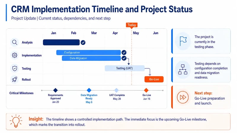
Use case:
A project team is reporting on the rollout of a new CRM system. Instead of presenting a long task list, the slide uses a compact Gantt chart that shows the phases for analysis, implementation, testing, and rollout, along with a milestone status tracker for critical deliverables. This allows the audience to immediately understand the current project status, key dependencies, and the next planned steps.
It is also helpful to see how project status can be visualized in PowerPoint so decision-makers can understand it at a glance, and how progress across projects, programs, or initiatives can be presented clearly on a management slide.
What all effective business slides have in common
Despite their differences, management, reporting, and project slides follow the same core principles: they prioritize the message, reduce clutter, and make information easier to read. Strong business charts are not designed to show as much data as possible. They are designed to make the most relevant information clear.
This is especially important in PowerPoint, where content is usually viewed in the context of presentations, decisions, and discussions. A strong slide supports the conversation. It helps the audience understand the information, put it in context, and take action. When the focus shifts from status updates or reporting use cases to market structures, it is also helpful to know how to visualize market share, segments, and relative sizes in PowerPoint.
When complex business slides are needed regularly, modern charting add-ins for PowerPoint are worth considering. They can create significant time savings during slide creation. Existing charts also do not have to be rebuilt from scratch. With a professional solution, existing PowerPoint charts can be converted.
Conclusion
To clearly visualize business information in PowerPoint, start with the message, not the data or design. Effective slides for management, reporting, and projects condense information, create visual hierarchy, and highlight relevance immediately. This is what makes them not only accurate, but truly understandable.
Want to visualize management, reporting, and project content in PowerPoint more clearly and professionally? Learn how empower® Chart Creation can help.

Excel-linked charts in PowerPoint
Free icons for your next PowerPoint presentation