- Chapter I: From art to artificial: Corporate images using AI
- Chapter I.2: Field test: AI-generated corporate images
- Chapter II: Corporate design: flexibility is the new consistency
- Chapter II.2: Digital display of designs
- Chapter III: Corporate Fonts: The silent essence of a brand
- Chapter III.2: Cloud fonts
- Chapter IV: C.G. Jung's archetypes
- Chapter IV.2: Branding for archetypes
Introduction
Welcome to the first issue of the Corporate Design Report in 2024
Discover the transformative impact of artificial intelligence (AI) on corporate design and explore the potential of AI-generated images.
AI-generated images: a new frontier? AI tools are increasingly accessible and advanced, making them a viable option for corporate images – provided they adhere to design standards. We‘ll walk you through the effectiveness of these tools in adher- ing to such standards, as well as considerations for creating AI-generated images.
Just like images, fonts are an essential part of any corporate design. Custom fonts, in particular, are central to corporate identity, offering unparalleled brand recognition. However, integrating proprietary fonts with common software like Microsoft Office can present hurdles, from accessibility to file size.
We will explore strategies to overcome these obstacles and enhance your font experience, potentially through cloud-based solutions.
We hope you enjoy reading!
The ability of artificial intelligence (AI) to create images that meet a company’s specific needs has created a paradigm shift in marketing and visual communications. Instead of relying on traditional, often time-consuming and costly methods of image production, companies now increasingly rely on AI tools to create customized images that reflect the company’s individual style. But how effective is AI-based image creation really?
How AI algorithm work in image generation
How does image generation work with AI tools? The AI starts working as soon as a prompt is entered. But what exactly is happening in the background?
Large amounts of image data are collected and used to train the AI model. These datasets typically contain images tagged with appropriate labels or categories to teach the algorithm to recognize certain patterns and characteristics.
Generative models such as Generative Adversarial Networks (GANs) or Variational Autoencoders (VAEs) are common architectures for image generation using AI. GANs consist of two neural networks, the generator and the discriminator, that “compete” with each other. The generator produces images, while the discriminator tries to distinguish between real and generated images. This competition between the networks leads to a continuous improvement of the generated images.
The quality of the generated images depends strongly on the quality and diversity of the training data, the model architecture, the how the model is designed to learn , and other factors such as the input of the prompts.
The better the prompt, the better the image
To achieve successful image generation with AI, the precise wording of the prompt is critical. The prompt is where you tell the AI—usually in English—what kind of image to create. To get the best results, you should follow a few tips when writing a prompt.
- Be specific: Describe the desired visual elements, styles, colors, compositions, or other specific features of the desired image as precisely as possible. The more detail you provide, the better the AI will be able to implement your requirements.
- Specific clues: Give the AI specific objects, scenarios, or visual references to refer to. This makes it easier for the AI to understand your expectations and promotes more accurate results.
- Natural language: Communicate with the AI as you would with a human designer. Describe the desired image in clear and concise words. Avoid unnecessary filler words and focus on the essentials.
- Experiment and adjust: It may take several tries and adjustments to the prompt to create the image you want. Experiment with different wording to see which instructions produce the best results.
- Use positive language: Describe what you want to see rather than what you don’t want to see. Negative information can lead to unwanted results. For example, typing “wedding party without cake” is likely to produce an image of a wedding party with a cake. You should avoid such phrases and use the AI-specific equivalent of the “--no” parameter in Midjourney prompts to exclude certain content.
- Set the aspect ratio: Note that the aspect ratio can have a significant impact on the result. To ensure that the image is what you expect, specify the desired aspect ratio directly in the prompt. For example, if you want to show a single person, portrait format often works better unless there are several people. In Midjourney, you can specify the aspect ratio by typing “--ar 16:9” after the text command, where the ratio after “ar” is the aspect ratio you want. In DALL-E, you can also specify the desired aspect ratio at the command prompt. In Adobe Firefly and Lexica, you can select the aspect ratio by clicking on it or using a slider.
Don’t forget your corporate design
The first experiments with AI tools can be fascinating. But what you may wonder, happens if you change the prompt just a little? In such moments, curiosity can quickly take over and corporate design fades into the background. This isn’t advisable, because images are an essential part of corporate design. They create a strong visual connection to the brand and promote recognition among the target audience.
AI-based image generation requires a deep understanding of corporate design. When you hire agencies or graphic designers, provide them with your brand style guide. The same goes for AI tools. The AI must be able to interpret and implement the style guide. But unlike agencies or designers, AI has no memory. Experience through experimentation is very important.
Before you begin, familiarize yourself with the imagery in the brand style guide. What’s typically depicted? What are the preferred lighting conditions? What’s the common color scheme? This information should be built into any prompt as background knowledge.
Many tools also allow you to upload reference images from existing image databases for the AI to use as a guide. This can ensure greater consistency with corporate design.
It’s important to review all generated images. Does the image adhere to your corporate design guidelines? Are the images flawless or are there any errors? Often hands or people in the background are not shown completely—beware!
Challenges of AI-based image generation
Despite the hype and enthusiasm, we mustn’t overlook the fact that AI-based image generation also brings with it some challenges and difficulties.
- Image quality: The quality of generated images may not always meet desired standards. Especially with limited or insufficient training data, it can be difficult for an AI to correctly represent complex details, textures, or fine nuances. People or objects in the foreground are often acceptable, while the background appears chaotic.
- Ethics and image rights: Using AI to generate images raises ethical issues, particularly with respect to the use of data, potential misuse with fake or misleading content, and risks that images could be misinterpreted. In addition, there is often uncertainty about usage rights to the images.
- Prejudices and stereotypes: If the training data of AI models contains biases or isn’t diverse enough, the generated images may also contain biases or stereotypes.
- Privacy and data security: AI models for image generation typically require large amounts of data. The security and protection of sensitive data must be ensured to comply with privacy policies and ethical standards.
In addition, not every area of life is suitable for image generation by artificial intelligence. For example, the use of AI-based imagery in the context of humanitarian aid could be problematic. A lack of authenticity in images that are primarily used to evoke emotions in order to generate donations could severely damage the credibility of an organization and deter potential donors. So it’s important to carefully consider when and in what context to use AI-generated images.

AI-based image generation
The variety of available tools is large and growing. As a rule, paid tools deliver higher quality than free ones. Nevertheless, free tools can be sufficient to enter the world of AI-based image generation and offer a wide range of possibilities.
If you want to use generated images commercially, for example in marketing campaigns, it’s important to choose tools that explicitly allow commercial use. Before publication, do careful research and, if necessary, seek professional advice.
Popular tools include Midjourney and DALL-E from OpenAI (ChatGPT). Companies like Canva, Adobe, and Lexica also offer their own image generators.
The way these tools work is basically the same. You log in to the platform and enter what you want the AI to generate in the prompt field provided. Shortly thereafter you’ll get several results. Choose your favorite or adjust the query if you aren’t yet satisfied. Once you have a good result, final result is your AI-generated image ready for download.
Results may vary depending on the AI tool used. We at empower® have conducted a field test to generate a corporate image that meets our guidelines and is ideal for the cover of this issue.
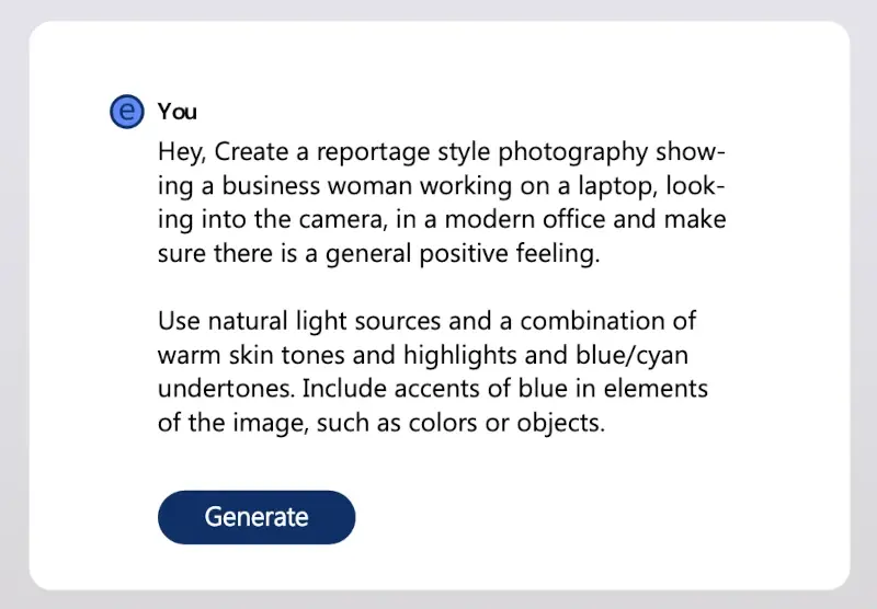
We tested the following prompt in DALL-E, Adobe Firefly, Lexica and Midjourney:
DALL·E (ChatGPT)
The results of our tests consistently show flawless people: full lips, smooth and radiant skin. People smile into the camera as desired. However, the eyes often have different colors and the images overall don’t look very realistic. On the other hand, we found relatively few inconsistencies in the fingers. The representation of fingers in particular is still a challenge for many AI tools. In our test, only people with white skin were displayed.
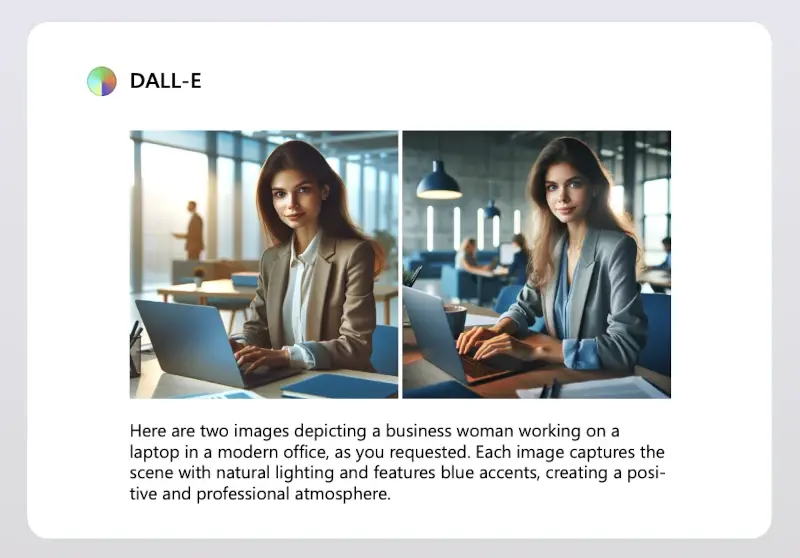
The background shows modern office landscapes. The desired blue accents can be found here: blue lamps, furniture and office accessories. Warm, natural light sources are also present, although the overall impression is rather dark.
Although this AI met all of the prompt’s requirements, the images are very smooth, rather dark, and not very realistic, making them unsuitable for our corporate communications.
Adobe Firefly
Adobe Firefly is part of the Adobe Creative Cloud and available at no charge to Adobe subscribers.
The results are stunning. The images look photographic, realistic, and vivid, thanks to many small details such as jewelry, watches, and fine facial features like wrinkles and freckles. As with all other AI image generators, the reproduction of fingers isn’t always flawless, and sometimes the facial expressions of the people seem a bit lacking. The people depicted are more diverse and varied than in DALL-E.
The office environments in the backgrounds are a bit simpler than in DALL-E. However, blue accents and undertones are still present, as well as in the clothing of the people. Natural light sources make the images bright and inviting.
Adobe Firefly met our brief almost 100%. The results are very close to our corporate images.


Midjourney
Midjourney is one of the most popular AI image generation tools. A Discord account is required to use Midjourney. Free use is paused from time to time and isn’t always available. Midjourney offers four different subscriptions, the cost of which varies depending on the type of subscription.
Overall, the results are promising. Some pictures seem less modern than others. The people depicted are mostly blond and light-skinned, of varying ages. They appear realistic, although there are problems with the depiction of fingers.


The backgrounds are varied and mostly modern in design. Blue accents can be found in all pictures, with the blue blazer being particularly popular. In the picture below left, Midjourney has created a completely new variation of a laptop.
Despite some flaws in the images, the images created with Midjourney come closest to the requirements of our corporate design, closely followed by the images created with Adobe Firefly.
Lexica
Lexica Art is a search engine for images created with the help of artificial intelligence. It allows you to search for images generated with Stable Diffusion or to create your own images based on text. The first images can be generated for free.
At first glance, the results generated by Lexica look very appealing and impressive. On closer inspection, however, errors become increasingly apparent, especially in the area of the hands.
The people portrayed in our test are varied. However, many of them aren’t looking at the camera, even though this was required in the prompt. Some people even have their eyes closed.
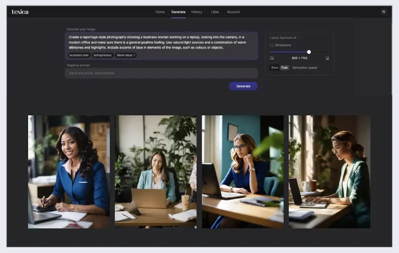
Compared to Adobe Firefly, the backgrounds are much more detailed and modern. Most of the images show plants in the background or on the desk. In some cases, however, objects appear that have no discernible use and seem out of place. While we miss blue accents or undertones in many of the images, the light source specifications were largely followed.
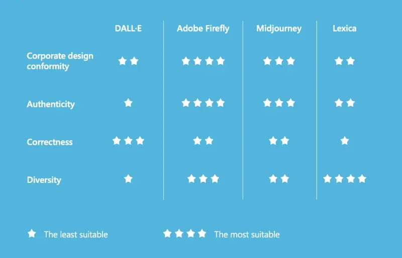
Our test results at a glance
How suitable are the AI tools tested for creating corporate images?
The test was conducted in early 2024.
Conclusion
Field testing of AI-based corporate image generation has yielded a variety of results that illustrate both the immense potential of this technology and the challenges it presents.
Some tools tend to produce idealized and stereotypical images. This is due to several factors, including the models’ training data and prevailing cultural norms regarding beauty and aesthetics. It’s important to note that AI models reflect the patterns of the data used to train them. However, this can be counteracted by making specific adjustments in the query to encourage more diversity.
Careful review of the generated images is critical to ensure that they’re consistent with corporate design guidelines and meet the necessary requirements. With proper attention and experience, these tools can create corporate images quickly and cost-effectively. It’s advisable to think carefully about the context and purpose for which AI-generated images will be used. At empower®, for example, we can imagine using AI-generated images in e-books or white papers.
More and more brand messages are reaching us through more and more channels. "Faster, louder, more varied" is the motto of today's brand communication. This development leaves its mark on corporate design. Florian Schubert, owner of INTO Branding, knows that everything has to be more flexible and still easy to handle. In this interview, he explains how to meet these requirements and why a tight brand corset is no longer in keeping with the times.

At INTO Branding, a corporate design and branding agency in Munich, Florian Schubert supports companies in mastering today's challenges in brand strategy, corporate design, and brand management, and in impressing with a well thought-out brand presence.
Florian, many marketing and branding managers take an increasingly flexible approach to corporate design. What's your experience in this area?
It depends on the use case and the client. We work a lot in the financial sector, where this is perhaps seen in a more classical way. With larger clients and B2C companies, it's completely different.
What do you think is the reason for this development?
Requirements have changed and evolved fundamentally - generally in terms of corporate design and what design is supposed to achieve. In the past, everything was very static. You had a thick set of guidelines, a very regulated design, where all print products were really thought through, with spacing, text sizes and so on. That is certainly still relevant for large companies today.
But aren't these highly regulated designs the exception rather than the rule today?
Channels have evolved, so corporate design has to be much more flexible than it used to be. This also means that companies rely more and more on dynamic visuals. Consumers interact with brands through many more channels, especially in the digital realm. Particularly in social media, you have to communicate louder and in more different ways. You can't operate with a complex set of rules. Today, ideas have to be produced faster and faster, which requires a high degree of flexibility.
Brands can no longer be forced into a straight jacket that considers every application in detail. There are simply too many of them, and communication today has to be more diverse.
How does this affect corporate design?
Design systems that consist of more than a logo and a few colors need to be much more variable. For example, the typography, color scheme, or even the logo will change depending on the context. Perhaps there will be more than one logo. This is an increasingly important development.
What does that mean for your work and your customers?
The challenge for us, but also for our clients, is to develop design systems. Systems that create freedom, but at the same time preserve the core identity. The question is: how much freedom do you give and how many rules do you need? The goal is to ensure that the brand remains recognizable as a whole and can be optimally adapted to the various channels. This means creating a design that remains consistent and recognizable across platforms, from social media to print.
Do you have any tips for implementing such design systems?
Don't leave anything to chance! You should consciously decide how much freedom you want to give. Of course, you can vary this depending on the design concept. It certainly makes sense to use uniform fonts or a uniform logo if the colors are very variable. You can also opt for a consistent, strict visual language, but allow more freedom in other areas.
A branding system has so many screws to turn that it really can be defined very differently from case to case. But be careful. It's all about creating a brand that is both recognizable and can be used across different media in the long term - and above all, that doesn't get boring.
How does this go against the trend of brand simplicity?
A brand always has to be applicable. It depends on the target audience and who is working with the brand. For example, the marketing team or corporate communications can implement the design much more professionally and make better use of complexity or freedom than people who aren't involved in design on a daily basis.
That's why I think it makes sense to reduce complexity. The brand has to be as easy as possible to use in everyday life. It should make work easier, not harder.
“When you have a very clear, simple design, you have to communicate all the more precisely.“
Can you give us an example?
An example would be creating high quality documents and presentations that emphasize the professionalism of your thinking. So you have to weigh things up: What is internal communication and what is external communication? What happens on the website or in social media is usually well thought out. Behind it is a professional team that knows how to play with freedom, but also knows what it's doing.
For example, in my opinion, creating Office templates that are as variable as possible would raise more questions than solve problems in day-to-day use. We also create Office templates, classic master documents. The real question is how well you can use them in your day-to-day work. The choice of fonts plays an important role. You may have to find much more pragmatic solutions here, which may not be as aesthetically pleasing as we would always like, but in case of doubt, anything else makes no sense for the customer or in terms of implementation.
So, you recommend distinguishing between internal and external communication?
Ideally, yes. It's about tailoring the corporate design to the users and their needs.
There are two different audiences. On the one hand, the internal target group is primarily concerned with day-to-day business. Here, it may make sense to take a more relaxed view of brand compliance, since the primary goal is to work efficiently and produce a clean document. Ideally, of course, it supports the brand - or at least doesn't damage it.
On the other hand, external communication through various media should take place within a very controlled framework.
So, it's more about practical application of corporate design than perfection in every detail?
Yes, you could say that. But there's another trend that impacts on implementation and accuracy: the trend towards minimalism in design. A lot of redesigns and new brands are very minimalist - very clean, very simple typography, very clear colors, and a logo that's reduced to a minimum. This principle of minimalism is becoming more and more important in branding.
The challenge is that when you have a very clear, simple design, you have to communicate all the more precisely. If the implementation isn't right, it's immediately noticeable. This is about things like white space, proportions, and font sizes.

There's a fine line between minimalism that looks elegant and minimalism that looks interchangeable. You have to be careful not to reduce the brand to the point where too much of the core is lost. This trend works well with bright colors and a pop imagery style, especially in the digital realm. The important thing is that it is well done, has a strategic basis, and fits the identity of the company or brand. Many developments turn out to be short-term design trends that don't benefit every brand.
Is the trend toward minimalism limited to certain companies or industries?
The trend has been particularly noticeable in the automotive industry, but not to the extent described above. That industry tends to have very well thought out corporate identities with a certain depth to them. The minimalist design can be found especially in SaaS companies and start-ups. The reason for this trend is also better digital presentability.
The issue of "print versus digital" is particularly important when it comes to color. In the past, the printability of colors was one of the most important requirements. I remember standing in the marketing department of a client in Berlin and checking with Pantone fans and proofs to see if our green was printable. That would be almost unthinkable today.
The digital color spaces that we see on the screen today are much larger than the color space that can be printed in classic four-color printing with cyan, magenta, yellow and black. When producing brochures or trade show booths, colors are mixed from these four inks. This narrows the color palette significantly, meaning that the colors aren't as saturated. Theoretically, you could use Pantone colors, special colors that are precisely mixed and look wonderful in print, but are also extremely expensive.
However, this is no longer as relevant to our customers because they hardly ever use printed products anymore. They are weighing up where they communicate more: digital or print? In most cases, the answer is digital, where the brand is omnipresent. Occasionally, there are still a few brochures, so many make a compromise and choose a color solution that's close to that. Otherwise, the color palette would be too limited.
What do you think are the most important stylistic elements that characterize a design?
I would say: logo, color, font. In that order. Of course, the visual world shouldn't be neglected. I'm a big fan of a consciously defined visual language based on a set of rules that define tonality, color, lighting mood, composition, content, etc. Again, you have to differentiate from use case to use case. Social media, for example, often offers more creative freedom.
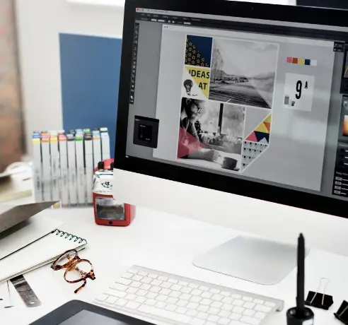
“Once you become familiar with the subject, AI tools are very powerful...“
Perhaps even more important, but often underestimated, is tonality. How does the brand feel? How do I communicate? How do I appeal to my target audience? We advocate a holistic approach in which a brand positioning, a specific brand story, is communicated both externally and internally. This is done visually, but of course also through messages and tonality.
Artificial intelligence is an important topic that can no longer be avoided in the world of images. We also work with AI for our clients and it's proving to be an extremely helpful tool.
Which tool did you use for AI-based image generation? Were you happy with the results?
We worked with Midjourney, among others. It always depends on what your goal is and what results you want to achieve. It's fascinating to see the possibilities that're already available. Once you become familiar with the subject, AI tools are very powerful, even if many things are still limited at the moment and you can clearly see that images have been generated with AI. But if you think about what was possible four years ago and what will be possible four years from now, I expect great things. It will change the industry a lot.
For example, we used AI to create 3D renderings of abstract nature images for clients. The goal was to show the perfection of nature, whether it be ferns, trees, or coral. With the help of AI, we were able to quickly add more variety to the motifs. These are all natural shapes, some of which are based on mathematical formulas. Combining the perfection of nature with a technical component is where we think the use of AI is very relevant.
Are there other use cases?
Another area where AI can be used effectively is in idea generation. For example, if you want to present an ad motif, a key visual, or something similar to a client, a designer could spend half a day Photoshopping ideas. Alternatively, you can use the right prompts and visualize a good idea in no time.
Recently, AI has also become part of Photoshop. If I have an image and I realize that I need more space above a person's head, or that I think the tie is stupid and I would rather have a bow tie, I select the element and ask if I want to change the tie. I then get several suggestions and choose the one I like best. It's incredibly convenient.
“...integrated AI that generates images or pictograms according to corporate guidelines. I see a lot of potential here.“
How important is it that images are truly unique and not used by others?
Again, there's a distinction to be made. Not every white paper has to contain images that I have taken. However, for recurring key visuals, I prefer to use images that I've taken myself. Real people always convey a certain authenticity. You can always tell whether it's a stock photo or an original image. You can't really convince with stock photos. It's the office, it's the people. It's the little details that make the difference. If you have the budget and the desire to convey authenticity, I would definitely recommend a shoot.

Is this a recommendation for shooting with people from your own company?
Large companies don't necessarily have to represent their employees. The focus and standing is different. It's not about saying: "Hey, we're company XY, we're a great community and we build great products." But with startups, SMEs, or service providers, the people are usually behind the product, or the people are the product. If you're trying to portray something that's obviously not true, you're going to get a big headache from the audience.
How do you ensure that only corporate images are used in the office? How can AI help?
There are already brand management portals that aim to simplify the brand-compliant use of content. You at empower® are one of them when it comes to Microsoft Office. It's all about image database management and integrated policies. AI also plays an important role here - integrated AI that generates images or pictograms according to corporate guidelines. I see a lot of potential here. This may not be a positive development for the photography industry, because customers are less and less understanding why they should pay for a shoot when they can get stock or AI photos cheaper, even if the quality is not always comparable. However, if you search long enough, you can usually find something suitable - especially if you invest a little more money in higher quality image databases. This is often still cheaper than the cost of a photo shoot.
When could such AI solutions for image generation become standard?
There's still a lot of work to be done. With AI, you don't automatically get perfect results. There's a certain level of complexity involved, probably similar to that of a photographer. Also a lot of issues need to be addressed, especially around copyright. In addition, many results are far from usable. Many details in the image often aren't correct; for example, on closer inspection, you can see that the people in the image have six fingers.

Finally, the fundamental question is: What are the implications of deviations or inconsistencies in the corporate design? When does it become critical?
It becomes critical when it's unintentional and deviations lead to inconsistent brand experiences that dilute the brand image and leave an unprofessional impression. Every customer touchpoint is important in creating a level of consistency. That doesn't mean everything has to look the same, but it does mean it has to be well thought out and not left to chance. Everything else can be seen and felt. At the end of the day, the brand depends on the gut feeling that remains.
What do you think the actual damage is?
It can't be measured because it's mostly a gut feeling. If a highly professional product based on reliability is perceived as a botch at many points of contact, that creates a gap in the mind that affects the image and impression of the product.
Let's take this a step further: you get an unprofessional presentation, the business card you receive looks cheap, the booth at the trade show is a run-of-the-mill booth with a cheesy claim, and the website isn't well thought out. One thing leads to another, and each time the trust in the brand is weakened a little more.
A lot happens in the subconscious and in the gut. However, I'm convinced that it's the many small details that make all the difference.
Does the headline look familiar? Do you recognize the font? The recognition value of typefaces is impressive. Not surprisingly, they're one of the most important elements of corporate design. Much more than just letters on a screen or paper, fonts are the silent essence of a brand, a company, or an identity. Many companies rely on custom-designed or licensed corporate fonts. But as unique as these fonts are, integrating them into everyday office life can be a challenge.
The importance of corporate fonts
Not only are colors and logos instantly recognizable, but corporate fonts are especially memorable. Corporate fonts form an integral part of a company's visual identity, recognition, and brand image. They contribute significantly to a consistent and unmistakable appearance, whether on packaging, websites, advertising materials, or in corporate communications.
The benefits of a corporate font are not only enjoyed by large corporations, but also by many small and medium-sized businesses. House fonts strengthen brand identity, recognition, and individuality.
Standard system font vs. corporate font
But what characterizes a corporate font and how is it different to standard system fonts?
Standard system fonts
System fonts are pre-installed fonts that come with an operating system without additional installation. Every operating system, whether Windows, MacOS, Linux, comes with a selection of predefined fonts.
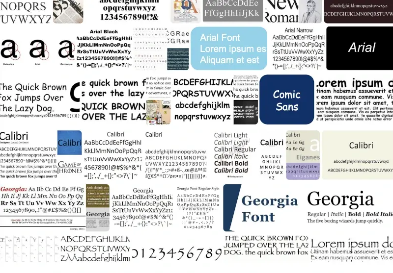
These standard fonts are used in various contexts, including the user interface of the operating system itself, in system applications, or in documents created with various applications. Examples of system fonts include Arial, Times New Roman, Verdana, Calibri, Segoe UI (in Windows), Helvetica, or San Francisco (in MacOS).
Their wide availability and consistency across systems and devices make them a practical choice for general applications. Whether offline or online, formatting problems are rare when transferring documents.
The big advantage of Microsoft system fonts: thanks to the ubiquity of Windows, most documents look exactly the same on the recipient's screen as they do on the sender's.
Corporate fonts
Corporate fonts are fonts designed or licensed specifically for a particular brand or organization. They're much more than just letters; they convey emotions, values, and personality.
Unlike system fonts, corporate fonts are typically not pre-installed. This presents a number of challenges, especially if the fonts are to be used in everyday office environments and applications, such as Microsoft 365.
Developing your own corporate font is an investment. Just designing a single style of a sans serif Latin font with an extended character set (approximately 450 characters) can cost around $6,500. Depending on the number of styles and the licensing, the total cost can quickly add up to a five-figure sum. The exclusivity of a custom developed font plays a decisive role here. However, the advantage is that there are usually no follow-up costs.
A less expensive alternative is to purchase a standard license for a basic font and customize it to your needs. This way, you can have your own corporate font for less than $1,000 for a few styles. Depending on the size of the company, the most common alternative is to purchase a licensed font from a font foundry. Web and print fonts range from about $20 to $85. For web fonts, there may be additional fees based on the number of clicks (typically 10,000 or more page views per month).
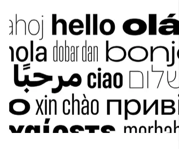
There are many examples of successful corporate fonts

Licensing corporate fonts correctly
- Is the font for internal use only?
- Will all employees have access to the font or only selected employees, such as the marketing department?
- Is the font to be used in a commercial project?
- Is the font part of a final product that'll be used by customers?
If more than five employees use the corporate font, a multi-user license is required. Anyone needing additional rights should negotiate an individual license agreement with the vendor. A variety of agreements are available, but it's important to keep an eye on the costs involved. As the number of licenses increases, so do the costs.
It's not enough to simply install corporate fonts
By purchasing an appropriate license, you can install your own font so that the font files are immediately available on your computer. This allows you to use the font in various applications on your computer. However, this is usually not enough.
If you want to send a document externally, you need to embed the font so that the document will display correctly on other devices that do not have the font installed. After all, the most beautiful corporate font is useless if it doesn't display correctly.

Embedding challenges
Embedding fonts in documents can significantly increase file size because the entire font file is automatically embedded, even if only individual characters are needed. The font file contains various character sets as well as information about the font itself. This additional metadata is necessary for correct identification and processing, and also increases the file size of the document. This is especially true for large font families, such as Chinese or Arabic, or for fonts with many alternate characters.
This leads to the following problems:
- long loading times
- problems sending and receiving
- maximum storage quickly reached
In such cases, other system fonts are usually used by default.
What happens if a corporate font isn't used consistently?
Inconsistent use of a font is often a problem for organizations because of the challenges mentioned above. When fonts are used inconsistently or even mixed and matched, it can have a negative impact on the look and feel of a brand or company. This includes dilution of the corporate design, loss of recognition, and the perception of unprofessionalism or lack of care.
How can you solve this problem?
In many organizations, it's common practice to use system fonts, such as Arial or Times New Roman, in business documents, such as those created using Microsoft 365 applications. The corporate font is only used for special occasions or formats. These should be defined in the brand style guide so that employees know when and where to use which font. This eliminates the need for expensive licenses for the majority of employees and the need to embed the corporate font in business documents.
Cloud fonts are an alternative solution. These are fonts that are made available by third parties through cloud or web hosting services. They aren't installed locally on users' devices, but instead dynamically loaded from a server when the website or application is accessed.
- They offer a wide variety of styles and variants, providing greater typographic diversity and more customization options than traditional system fonts.
- They improve the load time of websites or applications because they don't need to be stored directly on the device. They're loaded only when needed, which can reduce the overall size of the website and optimize loading times.
- Cloud fonts ensure consistent and accurate display across devices and browsers, regardless of where the content is opened or who is viewing it.
- Font vendors can update and improve cloud fonts automatically so they're always up-to-date. Fonts are centrally managed and maintained on the provider's server.
Microsoft 365 provides cloud fonts hosted in the Microsoft 365 cloud. No special permissions are required to download them - they're available to all subscribers.
Once a font is installed, it can be used in most Microsoft 365 applications. Documents created with cloud fonts will always display in the correct font, without the need to embed the fonts - unless the recipient is working offline or with an older version of Microsoft Office. Microsoft Fonts for Windows are available in the following applications Word, PowerPoint, Excel, Outlook, OneNote, and Publisher.
Microsoft isn't the only cloud font provider. Google and Adobe also offer a selection of open source fonts. However, Microsoft fonts offer a major advantage: they're already pre-installed on Windows clients and therefore directly available in the various Office applications. Microsoft fonts are a good choice for those who value seamless integration and consistency.
The exact number of system fonts in Windows operating systems varies depending on the version or update, but is usually in the hundreds. Windows 10, for example, has about 200 fonts.
Cloud fonts typically offer a larger selection. With a Microsoft 365 subscription, users have access to about 900 fonts and 260 font families. Similarly, Google Fonts includes more than 1,500 fonts. Adobe Fonts, on the other hand, offers more than 20,000 fonts as part of a Creative Cloud subscription. The number of available fonts can vary with each provider, as new fonts are added and others removed on a regular basis.
Cloud fonts - a real alternative?
Cloud fonts are a good alternative if you want to avoid many of the problems associated with in-house fonts. Compared to system fonts, they offer more options and don't have to be embedded in every document that is sent externally. However, if you value individuality and recognition and are willing to make the extra effort, a corporate font is an excellent solution. A custom font communicates a company's identity with every text, no matter how small. For a long time, the focus was on reducing costs by eliminating license fees for existing fonts. Today, however, the focus seems to be less on cost and more on the pursuit of individuality.
What advertising appeals to you? Why do you automatically buy the same brand for years? Why do you choose a certain product when an equivalent alternative would be cheaper? The explanation lies in the psychological concept of the twelve archetypes according to Carl Gustav Jung. In this article, you'll learn about the background of this concept, selected archetypes, and how you can use them in your branding.
Carl Gustav Jung's concept of the twelve archetypes
To understand the significance of the twelve archetypes as a key driver of branding and marketing strategies, it's necessary to look at the history of analytical psychology. Its founder, the Swiss psychiatrist Carl Gustav Jung (1875-1961), recognized that people make decisions based on universal patterns of behavior and emotions. Jung went on to show that these patterns could be grouped into twelve archetypes.
It's interesting to note that this concept applies globally. Each person can be assigned to a specific primary archetype. Applied to brand strategy, this means that a brand can appeal to the same target group in different parts of the world, for example in India and Europe.
Jung once suggested that archetypes were hereditary and that everyone was born as one of the twelve types. Today, however, this theory has been disproved. In fact, our social and cultural environment determines which archetype we develop into over the course of our lives.
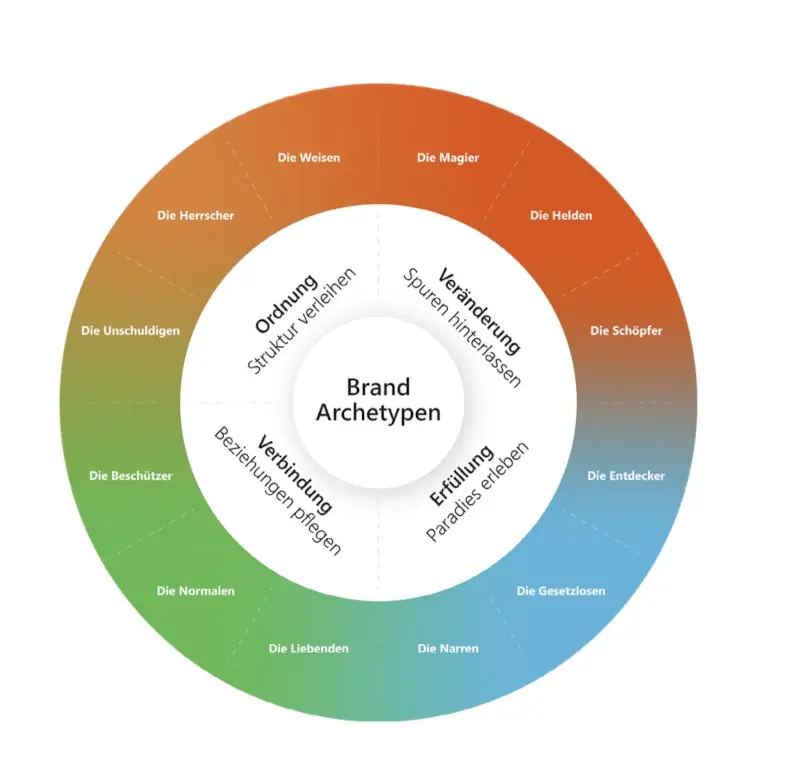
Overview of the twelve archetypes: social
The archetypes in this group emphasize interpersonal relation- ships and the feeling of connectedness. The Lovers symbolise love and intimacy, the Caregivers stand for caring and protec- ting others, and the Everymen represent the importance of community and social harmony.

Freedom
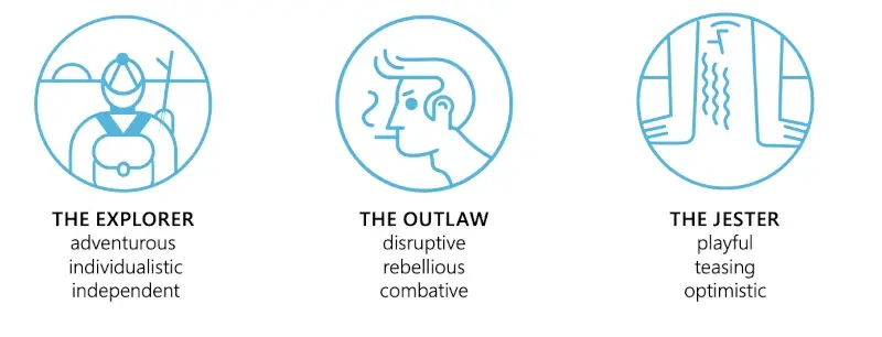
This group of archetypes strives to find fulfilment and meaning in life. The Outlaws represent the search for freedom from social norms and restrictions, the Explorers represent the urge for new experiences and knowledge, while the Jesters emphasize the need not to take life too seriously and to find joy and fun.
Order
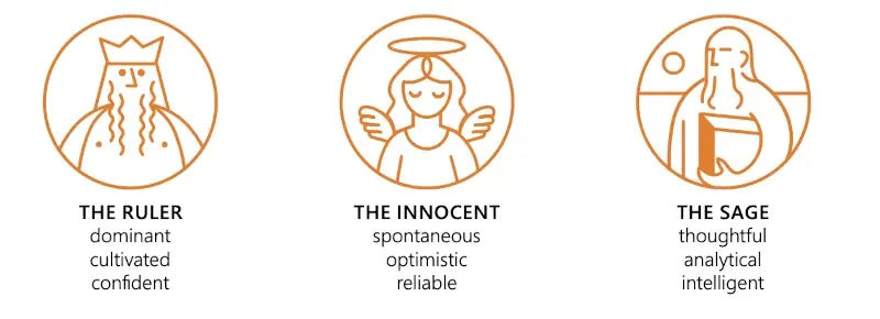
The archetypes in this group represent stability, structure and authority. The Rulers embody leadership and organization, the Innocents stand for purity and naive assumptions about the world, while the Sages stand for knowledge, wisdom and spiritual insight.
Ego
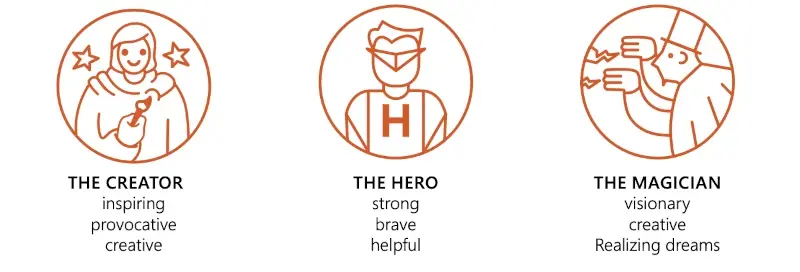
This group of archetypes emphasizes the desire for growth, transformation and innovation. The Creators embody creativity and the ability to create new things, the Heroes represent the courage and determination to overcome obstacles and bring about positive change, while the Magicians represent the power of change and manifestation.
Everyman, Ruler and Magician: three of the most popular archetypes
What sounds like the beginning of a fantasy novel is actually three common archetypes, which we will look at in more detail below.
The normals (also known as "Everyman")
The representatives of this archetype can aptly be described as idealists. Their emotional orientation is benevolent. They want to do good, have good experiences, feel comfortable and secure. Belonging is very important to this archetype. They want to be part of a group, but they do not want to stand out in any way. Harmony is important. So as not to upset the social balance, the Everyman is always friendly, level-headed and considerate.
Internally, this type faces several conflicts. On the one hand, they're trusting, but on the other, they're afraid of being exploited or rejected. The Everyman is basically optimistic and open-minded, but their enthusiasm is limited. These inner conflicts are often reflected in the way they're perceived by those around them: Everyman is a valued companion, but tends to be quickly forgotten.
The "everyman" archetype in branding
This type of person is a very broad target for branding and marketing campaigns. This is evident in the companies that target this archetype with their brand and advertising. IKEA, McDonald's, Sparkasse, Aldi Nord, and VW are good examples.
The Ruler
The Ruler archetype stands in stark contrast to the Everyman archetype. These people's primary goals are control and power, which in turn bring prosperity, success, and security. The path to these goals is paved by the archetype's authoritarian, dominant personality. Rulers are full of confidence, intimidating, take on a lot of responsibility and make high demands.
However, this doesn't necessarily mean that rulers are self-centered people. A harmonious environment is also important to them. Therefore, they use their position of power to bring about positive changes for their people. However, this only applies to those who support their leadership position and are loyal to them. If their position of power is attacked, the Ruler archetype will defend it by any means necessary.
The "ruler" archetype in branding
A brand targeting this dominant archetype should embody success. Luxury, tradition, image, and quality play an equally important role. False modesty is deliberately avoided. Marketing and branding campaigns based on the "Ruler" archetype can be found in companies such as Mercedes-Benz, Porsche, IWC, and Montblanc.
The Magician
People who belong to this archetype are characterized by a high level of creativity and a way of thinking that goes beyond conventional boundaries. Magicians are visionaries, focused on forward-thinking and disruptive ideas. They constantly seek knowledge that they're reluctant to share with others. Instead, they use their expertise to make their vision of the future tangible to the world, often literally. According to Magicians, the biggest hurdle is their own imagination.
The majority of this archetype work in the technology and/or start-up industries. However, the entertainment and gaming industries are also considered domains of this archetype.
The "magician" archetype in branding
If your brand, products, and/or services are seeking or implementing futuristic change, this archetype is for you. Examples include companies like Dyson, SpaceX, and OpenAI. This is also true if you create fantastic worlds through creative processes (Walt Disney, EA Sports, etc.) or make products that support Magicians in their endeavors (Red Bull, Coca-Cola, etc.).
In an age of trademark overload, almost all companies face a dilemma. In Germany alone, nearly 73,000 trademarks were registered in 2022, and the number is growing. With the rise of social media, marketing channels have expanded significantly, requiring new strategies to maintain or increase brand awareness. Consumers are bombarded with more advertising than the human attention span can handle.

For this reason, it's crucial to align the branding with the target group and to create an emotional connection with the target clientele. Target audience analysis using the twelve branding archetypes is a proven approach.
The goal is for the target archetypes to identify with your brand and make a purchase decision based on an emotional connection to your brand. Knowing what moves, drives, and appeals to your target audience, as well as their concerns, needs, and fears, will help you tailor your marketing strategy accordingly.
How can the concept of archetypes be used effectively in branding?
Targeting these archetypes has a positive impact on branding in several ways. For example, a clear differentiation of your brand is achieved, which sets you apart from your competitors in the market. This promotes clear brand awareness within the target group and strengthens loyalty to your brand.
It also helps you communicate your brand consistently, both internally and externally. This not only strengthens the corporate identity within your team, but also increases the commitment of the target archetypes to your brand.
Brand alignment with archetypes is especially important for the emotional connection your customers develop with your brand. It positions your brand as a "top of mind" product and successfully differentiates you from the competition. The archetype framework also provides an easy-to-understand and attractive definition of the brand personality for the target audience. It conveys clear values, increases trust and addresses the sometimes unconscious needs of your target group.
An example: RedBull
Red Bull demonstrates successful alignment of branding and marketing activities with a specific archetype. As we know, the company focuses on the "Magician" archetype, which is characterized by adjectives such as transformative, visionary, creative and powerful.
How does Red Bull communicate such values and characteristics so that the target group feels maximally addressed and develops an emotional bond?
The first starting points are the logo and the claim. With the slogan "Red Bull gives you wings", Red Bull focuses on the magical properties of the product, which should help to overcome limits. The logo, consisting of two bulls and the sun, has a mystical and powerful effect.
The positioning of Red Bull as a drink that helps people achieve their goals, transform themselves and perform at their best is underlined by a predominantly persuasive, inspirational and narrative style of communication, as expressed in the well-known TV commercials. The commercials show people (or animals) surpassing themselves and achieving their goals by consuming the drink.
The positioning is rounded off by the sponsorship of numerous events and extreme sports where people demonstrate extraordinary abilities and achievements.
The association of Red Bull with extreme sports and outstanding achievements evokes a sense of excitement and adventure in consumers. This encourages them to take risks and pursue their dreams. Consumers also often associate Red Bull with increased performance and focus, resulting in many people turning to Red Bull when they feel the need for an extra boost of energy to overcome challenges.
Another example: McDonald's
A common archetype for the food industry is the "Everyman". This archetype embodies normality, pragmatism, down-to-earthness, and a strong sense of community.
McDonald's is a good example of this orientation. The restaurant chain is known around the world for its affordable prices and the wide availability of its outlets. This makes the brand accessible to people from all walks of life. In addition, McDonald's offers a range of familiar menu items that are popular with a wide audience. In its marketing campaigns, the company often emphasizes themes of community and togetherness, whether through family meals or gatherings with friends. Emphasizing community and togetherness in brand communications helps customers feel part of a larger community. The company also often features a variety of people in inclusive advertising campaigns, reinforcing the message that McDonald's is open to everyone, regardless of age, background or lifestyle.
For many consumers, McDonald's is a familiar and comfortable place where they know what to expect. This creates a comfort zone that keeps them coming back.

The challenge of branding for archetypes
When focusing your branding strategy on one or more archetypes, it's important not to create false expectations among your target audience. Make sure that you communicate your brand message and company values openly and transparently. If your brand doesn't live up to its promises, or if your customers feel deceived by your marketing campaign, this will inevitably lead to a loss of trust. Such a negative image can have serious consequences.
It's equally important to avoid stereotypes. When branding is based on archetypes, there's a risk of limiting the individuality and diversity of the target audience. Even if the target group can be assigned to an archetype, this is different for each individual due to their complex psyche. Someone may tend toward one archetype in their behavior, but also exhibit traits that are attributed to other archetypes.
The twelve archetypes in branding

The twelve archetypes play a critical role in building brand awareness. Once identified, you can align all brand design and marketing campaigns with the targeted archetypes. The effectiveness of this approach can be easily seen in your own buying behavior and your favorite brands, which often end up in your shopping cart without competition. This affinity often carries over to the next generation.
Aligning branding with appropriate archetypes creates a deep emotional connection to your brand. Few methods are more effective at increasing both customer loyalty and brand awareness.
You may also like
Practical Office tips, inspiring stories, and market research on PowerPoint & Excel.
AI in PowerPoint: The real effort and how to use it intelligently

Your 3-level blueprint for template management in Microsoft 365


