
The fiscal quarter is coming to an end and your managers expect your report? Charts help illustrate developments and make data easier to see and understand. Learn which charts you can create without specialist charting software to make your reports more concise, and highlight developments more clearly. You can create Gantt charts and other complex PowerPoint charts without the need for advanced charting software in Microsoft Office.
What's in store for you in this article:
How to create charts in Microsoft Office
How to create area charts
When to use waterfall charts
When to use and how to create a choropleth map (world map)
How to create a network chart
When and how to create a mekko chart
When to use sunburst charts
Advantages of charting software
Disadvantages of charting software
How to create charts more easily in Office with empower®
Use Microsoft Office for these impressive charts
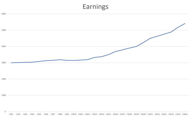
The more comprehensibly you design your reports, the more professionalism and competence they radiate. Well-designed reports clarify confusing numbers of data. Even if charts do not always track data absolutely precisely, charts put data in context and identify trends. Which of the two presentation methods do you consider clearer?
 |
|
Microsoft Office as charting software
Illustrations help us remember information. ClipArt and SmartArt are just two methods to achieve this. You can find both in the Microsoft Office applications.
Charts are more sophisticated ways to present data. In Word and PowerPoint, you can access chart templates by clicking the "Chart" icon under "Insert".
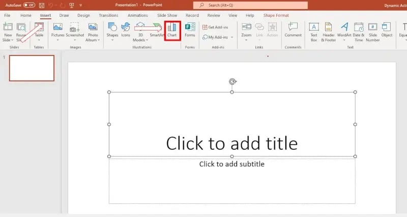
A popup containing a decent number of chart templates will open.
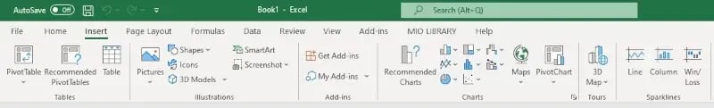
Excel works slightly differently. Here a variety of chart types appears on the Insert tab.
Some chart types are self-explanatory - column and pie charts are still familiar from math classes in high school. Below we will introduce you to some of the more complicated-looking charts and explain their functions.
Area chart
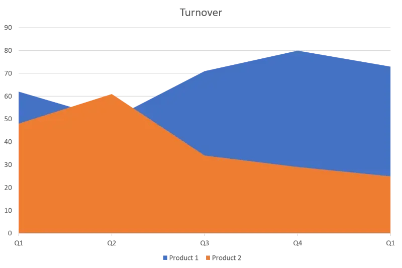
Differently colored areas display a cumulative total value in this type of chart. The areas represent separate categories and show their development as well as proportions for the specified period.
This type of visualization is suitable, for example, to compare the sales figures of different products and to show which products are responsible for how much of the total sales figures.
You will find the diagram template at “Area” in the diagram template menu, where you can also pick one of the six visuals for the chart.
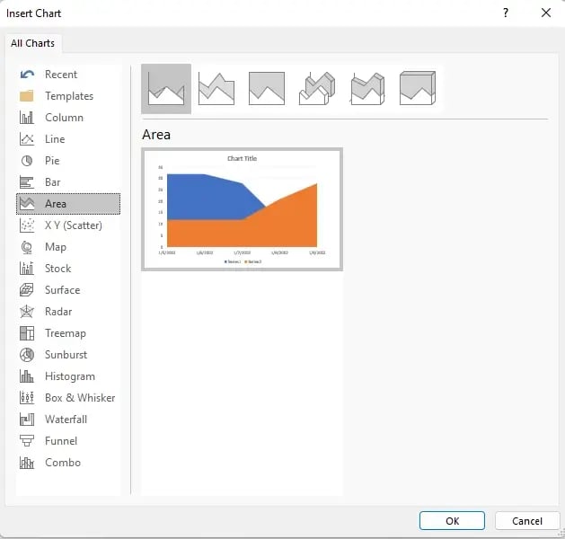
If you click “OK”, the following example chart and excel pop-up will open.
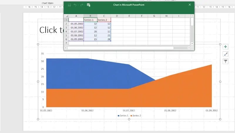
The purple-colored cells are the data shown on the x-axis of the diagram. Series 1 is the data for the blue-colored area, and series 2 is the data for the orange area.
You can add additional areas by dragging the edge of the chart into the next column with your mouse.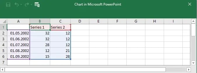
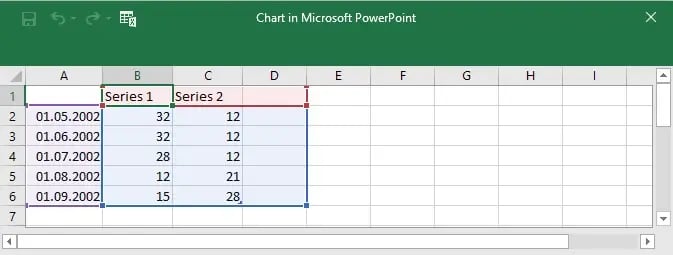
Give the new column a title and add your data. It will be shown as a third, grey-colored area in the chart.
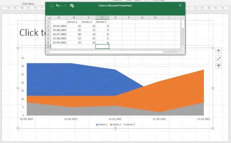
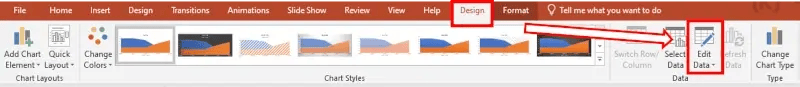
You can edit your data anytime under “Design” and “Edit Data”.
Waterfall chart
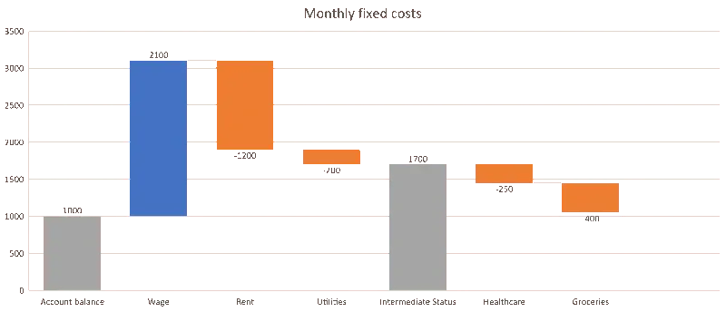
Also called a bridge chart, a waterfall chart shows the development of an initial value up to the final value. It includes positive and negative fluctuations. This chart can be used to track expenses and income budget movements.
Generating waterfall charts can be tricky, so we created a tutorial on how to create and edit waterfall charts. We also have a tutorial on how to create negative waterfall charts with positive values.
Choropleth map

A choropleth map uses differences in shading, coloring, and/or symbols in predefined areas to indicate the average values of a particular quantity. We demonstrate how to create a choropleth map in our article on creating a world map in PowerPoint.
This type of chart is familiar from the news. Recently, it has been used to illustrate COVID infection figures and daily counts nationally or internationally.
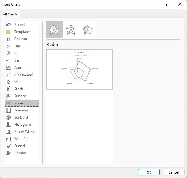
Network chart
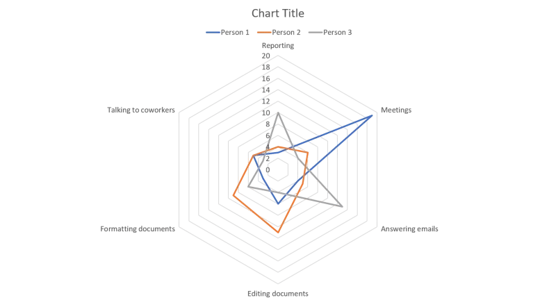
A network chart resembles a spider's web, but it is also called a star, kiviat, or radar chart. This type of illustration compares several categories’ values in one place. It combines the characteristics of tables, bar charts, and pie charts.
Network charts show not only individual values but also how they relate in a pattern. They make patterns and relationships across different metrics immediately obvious.
Contrary to the area chart, there are only three visuals between which you can take your pick.
If you click “OK” the following chart and Excel pop-up open.
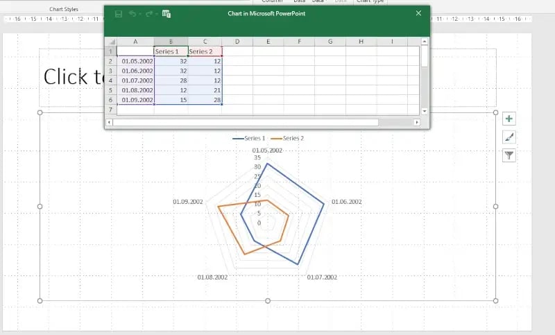
The purple-colored data in column A is the data that appears in the corners of the network chart. Series 1 is the data shown in form of the blue line in the diagram. Series 2 is the orange line. The proportions of the network chart adapt in proportion when you add your data to the excel chart.
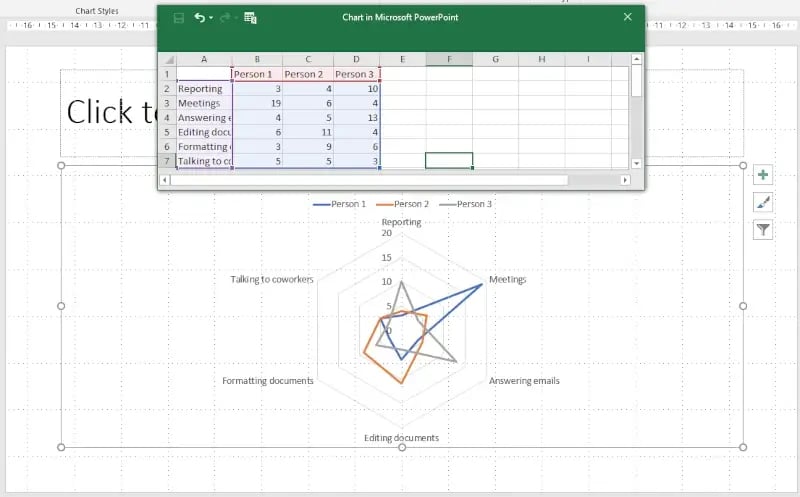
If you would like to add more lines to your diagram, simply drag the edge of the chart by the number of columns you would like to add.
Mekko chart
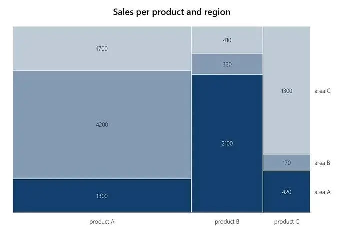
Mekko or mosaic charts – also known as Marimekko charts – are stacked column charts. In contrast to bar charts, which only vary in column height, you can also use the width of columns to convey meaning.
Mekko charts are very informative even if they are not very commonly used. To make it easier to see data belong together, mosaics of the same category should be colored in the same or at least a similar color. Even if Mekko charts may seem complicated at first glance, creating them is very straightforward. We have prepared a tutorial on how to create Marimekko charts for you.
Sunburst chart
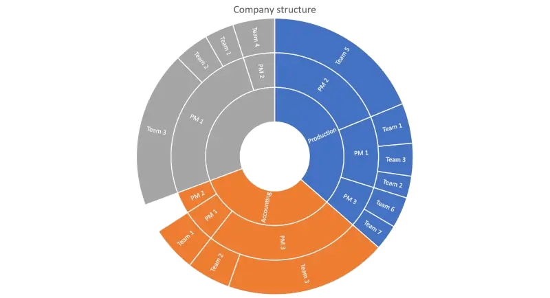
A sunburst chart is an advanced type of pie chart. In addition to data quantity or volume, data hierarchy is also presented in this type of chart. The further out on the ring, the more details are revealed. For example, annual sales can be visualized in reports, divided into quarters, months, weeks and even days.
Again, it is useful to highlight the corresponding data in the appropriate colors to provide an improved overview.
What advantages can charting software provide?
Even if charts improve the comprehensibility of reports, not everyone is an Excel professional. Figuring out in which column to enter which data and in which format takes a lot of time.
It is also important that the graphics do not look completely out of place in a reporting presentation. Aligning charts and reports with corporate design conveys professionalism - an important factor, especially when dealing with superiors and stakeholders.
Charting software should be able to help you with these challenges.
Disadvantages of chart software
There is an ever-increasing choice of charting software. As with MarTech Tools, you may not know where to start looking. Does your company even budget for such software? After all, charts can all be created in Microsoft Office.
You may think free software is a viable option. But is it worth downloading random apps from the Internet that may be buggy or incomplete – especially when they increase the risk of viruses or cyberattacks?
empower® is a leading chart software for Microsoft Office
We at empower® know Microsoft Office like the back of our hand. So we have developed an add-in for Excel and PowerPoint that not only makes it easier for you to create charts - with empower® you can also check for corporate design conformity and correct deviations with just a few clicks.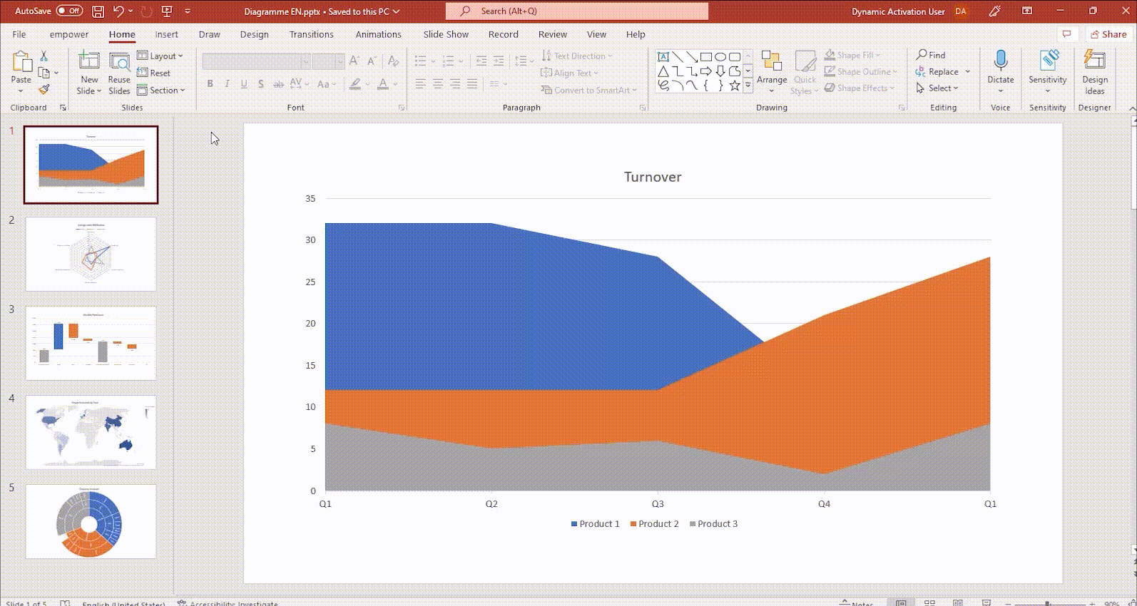
We take the complicated work out of Excel so that you can fully concentrate on the content of your presentation. By linking tables and charts in PowerPoint to Excel files, you easily create automatic reports and ensure that your presentations are always up-to-date.
Our empower® Content Enablement solution also simplifies reporting by providing a central library that manages reporting templates and updates them across your organization. The empower® Library makes reporting a breeze!
Contact us and learn from our experts how our charting software can save you time and reduce stress when reporting in Microsoft Office.


A List of the most useful PowerPoint charts

How to create a waterfall chart? A step by step guide