


Which types of PowerPoint charts are best suited for which types of data?
-
What message do I want to communicate?
-
What type of data am I working with?
-
Do I want to show relationships, trends, variances, or proportions?
-
How many variables are truly needed to support the message?
-
How many data points should be shown?
-
Which visual format makes the main message clear the fastest?
Types of PowerPoint charts and functions
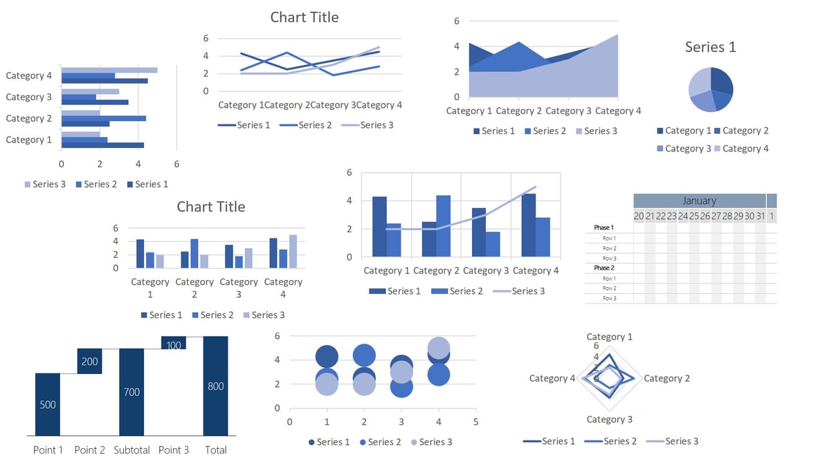
PowerPoint supports many more charts like:
- World map diagram (See here how to create a world map for free in PowerPoint)
- Course chart
- Surface diagram
- Network diagrams
- TreeMap chart (Office 2016 and later versions only)
- Sunburst chart (Office 2016 and later versions only)
- Histogram charts (Office 2016 and later versions only)
- Field and mustache charts (Office 2016 and later versions only)
- Funnel charts (Office 2016 and later versions only)<
Here you can find the entire diagram list from Microsoft.
1. Gantt chart
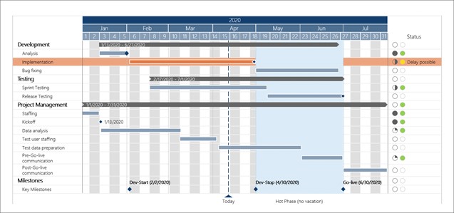
With a Gantt chart you can clearly display activities and milestones on a timeline - whether for a small project or a multi-year roadmap. You have the option to add lines, tasks, date lines, highlights, delays, and status symbols. Gantt charts are not included in PowerPoint but can be created directly in PowerPoint through empower® Chart Creation. However, you can create Gantt charts in Excel.
Example: This type of chart is especially suitable for calendar/project planner.
Manually creating Gantt charts for project plans and timelines in PowerPoint is time-consuming and tedious. With empower® you can create your Gantt charts in a few minutes and with a few clicks automatically. For example, you can show school vacations or structure your tasks in phases and collapse them when needed.
2. Bar chart
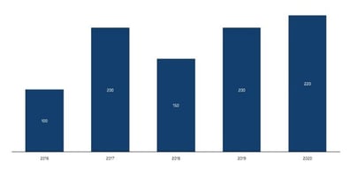
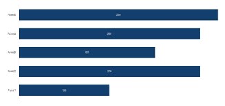
Bar or column charts are suitable for showing fluctuations and trends over a period of time. Size ratios in particular are best compared with bars or columns. Present multiple data series as either stacked or clustered columns/bars. With empower®, you can decide whether to display sum labels, connecting lines, and percentages. If needed, you can insert arrows or breaks to highlight key points in your data.
Bar charts are frequently used in surveys. Percentages and rankings are best visualized with bars/columns.
Example: This chart type is especially suitable for surveys, evaluations or statistics.
Learn how to create bar/column charts with breaks in PowerPoint.

3. Pie chart
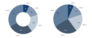
Pie charts show proportions of a whole. You can show absolute numbers, percentages, or labels in a pie chart. Time sequences are not suitable for pie charts.
Example: This chart type is mainly suitable for election results, market shares, etc.
4. Line chart
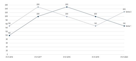
Line charts (also curve charts) present events and values over time. They also illustrate developments and trends. Several graphs can be compared directly with each other. The axis scale can be defined and the lines formatted.
Example: This chart type is suitable for example for stock prices.
5. Area diagram
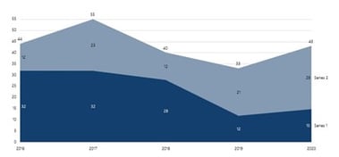
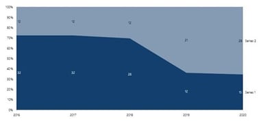
With an area chart, you can visually represent relative references of two quantities and how they change over time. This PowerPoint chart is especially good for visualizing operational and strategic gaps.
Example: This chart type is mainly suitable for sales and profit lineup.
6. Waterfall diagram
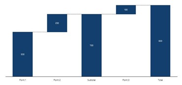
In a waterfall chart, growth factors or possible cost savings can be clearly visualized in step form. Waterfall diagrams are helpful if you want to visualize single steps of an increase or decrease during a process.
Example: This chart type is mainly suitable for total costs divided into individual costs.
With empower® you can easily create waterfall charts. For example, you can easily insert subtotals per data series and display multiple waterfalls in a single chart. You can also create waterfall chart backwards.
Here is our article: Learn how to create a waterfall diagram - step by step.
7. Scatter diagram
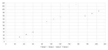
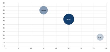
Scatter plots are useful when you want to visualize a large amount of data. They help show correlation and distribution analysis to reveal exceptions or outliers. Plot points with two dimensions in a scatter plot or add a third dimension using a bubble plot.
Example: This diagram type is mainly suitable for visualization of a data collection (for instance, speed of a car and braking distance).
8. Mekko diagram
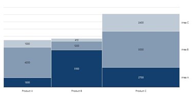
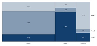
Mekko charts (Marimekko and Column Mekko) are also suitable for displaying a large amount of data. Let’s say you want to show how your company's sales distributed by segment and region in percentage terms. A simple chart would not show the relationship of the regions to each other. For this you need the Mekko chart.
Example: This chart type is mainly suitable for a snapshot of several market segments in a single chart.
Here is our article: Learn how to create a Marimekko chart in PowerPoint.
9. Radar chart
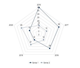
The network chart (also known as radar diagram) is particularly suitable for displaying the relative strength or expression of predefined criteria. Each criterion has its own axis, the zero point of which lies in the center.
Example: This chart type is especially suitable for comparing two companies or departments based on several criteria.
10. Combined/mixed chart
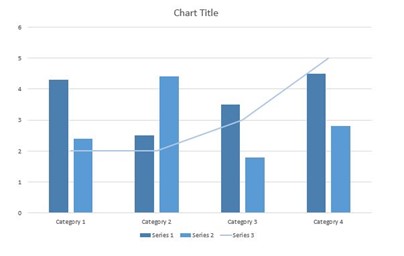
A combination chart, also known as a mixed chart, combines two different chart types in a single visualization, often columns and lines. It is especially useful when you need to present related metrics clearly in one view, such as absolute values and trends, volumes and rates, or budget figures and progress toward a target.
Example: This chart type is mainly suitable for sales, costs, and profit over time.

Our tip: Animate your PowerPoint charts
How to link PowerPoint charts with Excel
This brief overview of useful charts and diagrams should help you improve the expressiveness of your presentations. Using charts in PowerPoint presentations is an obvious choice because of the easy linking of PowerPoint with Excel. A PowerPoint Excel link automatically updates your data in PowerPoint, saving you valuable time. You can see how to automatically update chart values e.g. for quarterly figures in our article: automatically update PowerPoint Excel links.
Create complex charts with ease
With chart add-ins such as empower® Chart Creation, you can create charts faster and work more efficiently. empower® has already helped companies such as Continental and Bayer improve the efficiency of creating compelling, business-ready charts.
Compared with building charts and reports using only standard PowerPoint features, users of empower® Chart Creation regularly save 50% of their time. The solution includes all chart types commonly used in business, from waterfall and Gantt charts to Mekko and combination charts. With smart Excel integration and ongoing updates, linked charts, text, and shapes remain up to date at all times. Charts placed in placeholders are formatted automatically, while elements such as arrows and lines are arranged in a clean, consistent layout. The result is professional charts and reports that deliver clarity, consistency, and faster decision-making.
You can find complete information about empower® for Microsoft 365 on our website. You can also contact us directly.

How to create a waterfall chart? A step by step guide

Automatically update PowerPoint Excel links – save time and money